Color Theory and Personal Perception
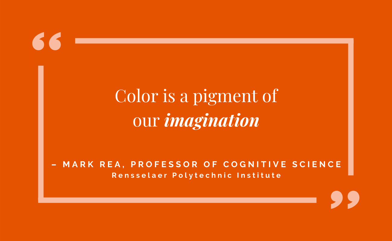
Color, by definition, is a matter of perception. But there’s more to color than simply seeing. Our brains process what our eyes see. Perception, in regards to color, is personal.
This idea may come as a surprise in such a significant area of graphic design that seems so well standardized by HEX codes, RGB ratios, CMYK specifications and the Pantone Matching System (PMS). But as noted color experts Joann and Arielle Eckstut discuss in their master class How To Use Color Theory To Enhance Your Designs from the Interaction Design Foundation, color very much depends on who we are and where, when and how we’re seeing it, all of which influences decision-making during the design process.
Who
Human physiology plays a big part on this point in that each person’s eyes, brains and nervous systems are unique to the individual, but consider the way we interpret what a color is and how we respond to it. Does seeing a shade of red signal danger? Or does it remind you of one of your high school colors? Is it Danger Red? Or Go-Team Red?
Where
Colors can complement each other and contrast each other. A shade of blue paired with a tan color might look completely different next to an orange tone. The same CMYK specification of blue in a child’s picture book takes on a different meaning in a medical journal.
When
Color is entirely dependent on light, and light varies dramatically from morning to mid-day to evening, whether you’re indoors or outdoors, and according to what light sources you’re using throughout the day or night — incandescent, fluorescent, LED light bulbs and more. Evaluate color choices at different times of day in different settings.
How
As a follow-up to Where and When, we perceive color differently in print and digital or broadcast. That’s why HEX codes and RGB ratios exist — for screens. CMYK and PMS are used in print. And of course, painters and artists blend their own combinations. The medium makes a difference, and it takes care and consideration to maintain consistency across multiple environments.
Implications
Professional designers know full well the complexities, challenges and opportunities of choosing colors and developing an effective color palette. For business colleagues and partners without design training, start thinking about color choices first through the lens of your overall goals, knowing that what one person sees and how they react can be totally different from someone else’s.
Questions to ask include, is this color or color scheme meant to stand out or blend in? Is the intention to be high energy or calm and soothing? Are we expanding on an established color with brand equity or starting fresh?
Knowing what you want to achieve and recognizing personal differences in perception establish a solid foundation for taking to market strong, creative work.
And in case you’re wondering if entirely new colors can exist, yes! Get to know YInMN Blue.
Published on: April 5, 2021