Branding & Design
Back To Trending

Type Tales: Navigating Font Frontiers

What Does Your Font Say About Your Organization? 

Font selection may seem like a minor decision in the grand scheme of your designs, but the truth is, it’s like choosing the perfect outfit for your brand. CEL graphic designer Anna Ingemann shares her insights on font selection, revealing they’re more than just pretty letters — they can make or break your brand personality. 

Serif vs. Sans Serif

Anna breaks it down: serifs are the classy, traditional folks who enunciate every word, like Times New Roman. On the flip side, sans serifs like Helvetica are more laid-back and modern buddies. So, are you more Shakespearean or Zuckerberg? Your font knows.

Takeaway: Choose wisely – are you a classic novel or a tech startup?


Example showing the serif on a font, vs a font without.
Serifs are the small lines attached to letters, almost like a brush stroke at the ends.
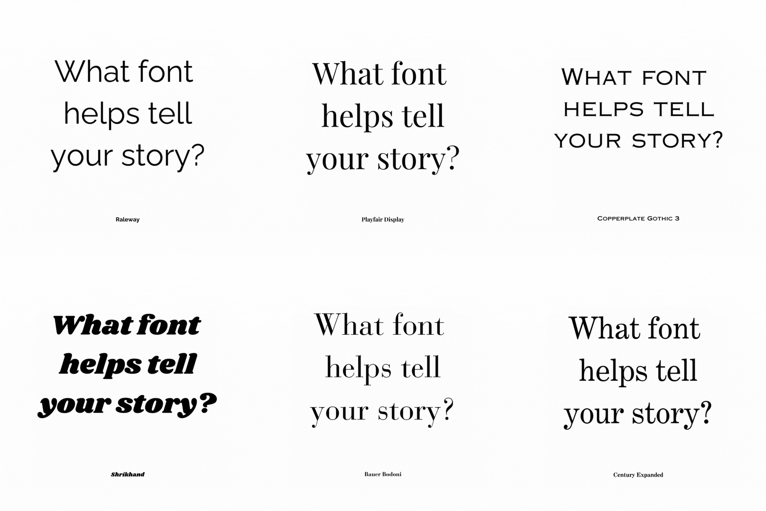
What Font Helps Tell Your Story gif that rotates through various different fonts

Readability

Imagine your font as a public speaker – if it’s all over the place, no one’s getting the message. Anna’s tip: keep letter shapes consistent for a smooth reading experience. And watch out for those x-heights – too tall, and it’s like shouting in ALL CAPS. Too short, and legibility decreases. For example, the height of the letter x in the Impact font family is taller than the x-height of New Times Roman and might be best used in a headline instead of the body.

Takeaway: Don’t be the font equivalent of a mumble – aim for clear and confident.

Example of x-height in fonts
X-height is the space between the baseline and mean line of lowercase letters in your font.

Mix and Match

Is there a Tinder for fonts? There should be. Font combinations are like the perfect power couple. Anna suggests pairing a headline hottie with a body text sweetheart. But beware, don’t go overboard – too many fonts are like a bad Tinder date (you can’t wait to get away). 

Choose a headline font that’s bold (maybe even a little playful), but stick with body text fonts that are easy to read. For accessibility, choose simple, distinctive letterforms over highly stylized scripts. There are even readily available dyslexia-friendly fonts like OpenDyslexic to optimize recognition.

Takeaway: Your headline and body fonts don’t have to match (you can even mix serif and sans-serif), but aim for legibility over style.

Consistency is Key

Your font needs to look good everywhere. Whether it’s on a business card, website, or packaging, your font should be consistent, no matter the size or color.

Takeaway: Be the Beyoncé of fonts – flawless and consistent across all stages.

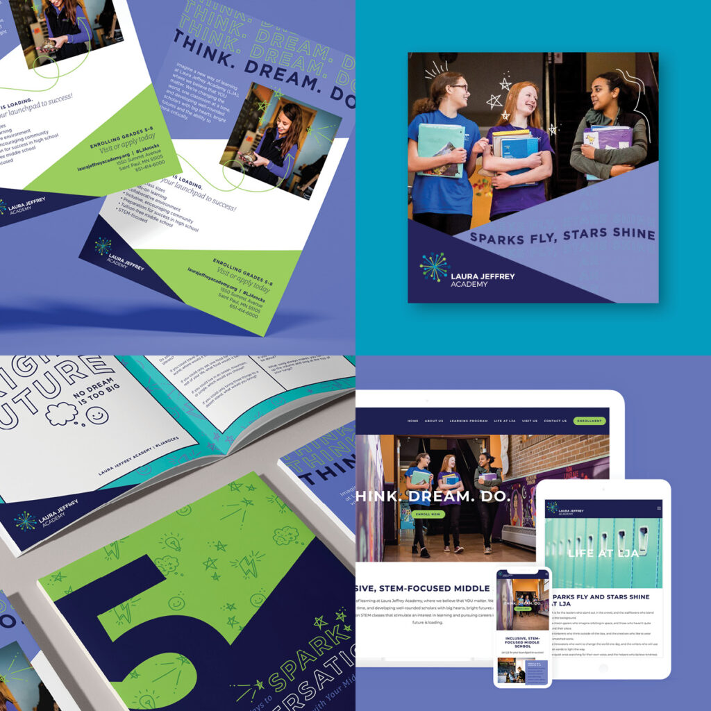
campaign materials integrated throughout multiple formats of web, print and digital

Lost In Translation

Fonts have cultural passports. A font that’s a hit in Germany might be the odd one out in the USA. So, when picking fonts, think globally.

“When creating a recognition graphic, be aware of stereotypical fonts,” says Anna. “A great example is Hispanic Heritage Month. There are certain fonts you’ll see commonly used in advertising every September. Rather than choosing a font that “feels Hispanic,” select a font that was created by a member of the group you’re celebrating. It’s much more authentic and honors the creators versus perpetuating a stereotype.”

Takeaway: Be the multilingual font whisperer – embrace diversity and avoid cultural faux pas.

Cliché Alert

Some fonts are like bad habits – overused, outdated, and cringe-worthy. Anna advises steering clear of fonts that stylistically don’t match your purpose. Sorry folks, but step away from Papyrus, Impact, and Comic Sans.

To be clear, we’re talking about your official organizational fonts. We know you’ll never pry Comic Sans out of the hands of your office workers…and that’s okay. Friday refrigerator cleanout fonts can be anything their hearts desire.

Takeaway: Avoid the font walk of shame – choose something unique but not too flashy. It will ensure your font has some longevity versus looking outdated. 

A person holding a sign that says in Comic Sans font: please clean out the fridge, we will toss all leftover items on Friday!!!

Expertise Counts

Font design is its own discipline. Type foundries devote immense care and craft to creating versatile, readable, authoritative fonts. Top brands consult typographers to make custom fonts that perfectly express their vision. 

But if you’re not Chick-Fil-A, creating a custom font may not make as much sense. Thankfully, thousands of high-quality fonts are available today. Chances are, your best font choices are available free in Google or Microsoft products.

There are plenty of fun free fonts available online, but they’re often created by individuals, and the quality varies. Use DaFont when designing your next music lyric tattoo, but avoid choosing a narrow-use font when designing the homepage for your organization. 

Takeaway: Collaborate with your tech team and select fonts that can be deployed across your network without breaking the bank.

What’s Trending?

Spandex is coming back, and you heard it here first!!

Okay, maybe not, but other 80’s trends are having a revival. “The 80s are definitely coming back in fonts,” observes Anna. “Using thin and narrow serif fonts with muted colors and grainy backgrounds is popular.” The good news? If you haven’t updated your website since the 80’s, you’re back in style, baby!

In reality, following design trends depends on your organization. For those heavily into consumer sales, knowing and following trends is often high on the priority list. For others, showing steadfast reliability is in order. 

Back to 80's Party graphic

Takeaway: Turning your homepage Barbie pink is fun, but it’s not a long-term trend. If your organization prides itself on remaining on the cutting edge of viral marketing, we recommend this time-consuming approach to following trends. But for most organizations, we recommend choosing fonts and brand designs that reflect your brand’s ethos and offer much more longevity.

In the end, typography is like the wizard behind the curtain – you might not notice it, but it’s shaping your brand’s destiny. So, next time you pick a font, remember: it’s not just letters; it’s your brand’s silent spokesperson. Choose wisely, and let your font do the talking!

Published on: November 21, 2023

Topics:

RELATED POSTS