What Makes Good Homepage Content?
5 Key Homepage Content Elements You May Be Overlooking
In today’s fast-paced digital landscape, it’s important to make a lasting first impression, and your website homepage is often the digital face of your brand. Its content plays a critical role in shaping perceptions and visitors’ actions. If you’re going to keep a visitor invested, your homepage must captivate and engage, convey the right message, and clearly represent your organization.
Let’s explore five key elements that can transform your homepage into a powerful gateway.
First Impressions: Logo and Branding Elements
When a user lands on your page for the first time, the first thing they should see is your logo and corresponding branding (including a favicon next to the URL). But more than that, your homepage has to represent what your website and your organization are about.
First impressions are crucial. Aim for a compelling headline, images that support your purpose and values, and consistent branding (including logos, colors, fonts, and other design elements). We love the below example from Cotter Schools — their branding and values are evident from your first click.
What Makes You Unique and Showcases Your Value
Social proof is a phenomenon that describes how people consider what others think before making their own decisions. Social proof can be particularly powerful in marketing your school or service. If you leverage testimonials and success stories of your existing customers or industry experts, you can influence new customer decisions.
Your website serves as the primary source to demonstrate what sets you apart as the top choice. Your homepage, in particular, is the ideal starting point for this showcase. It provides a golden opportunity to present a compelling overview of your offerings and the reasons why new customers should select you over competing alternatives. Here’s the homepage content you might include:
- Customer success stories or testimonials
- Quotes from company leaders or employees
- Statistics
- Upcoming events
- New programs
- New products
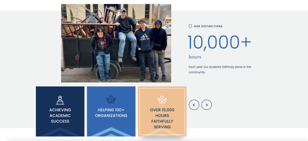
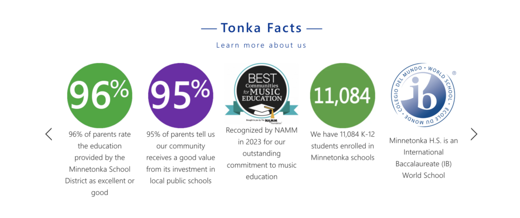
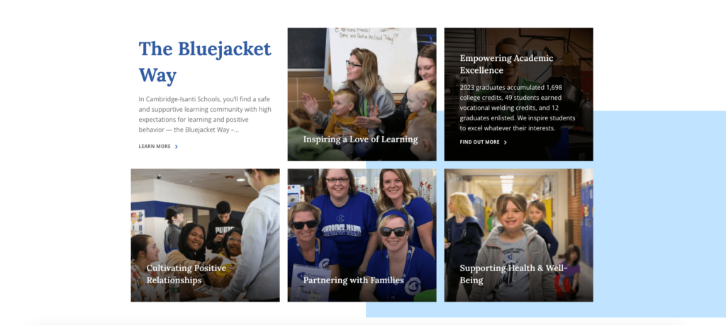
All of these pieces show the value you offer, which is why they should appear front and center on your homepage. Take Minnetonka Public Schools or Cambridge-Isanti Schools, for example. Both school systems proudly display their school statistics and unique offerings that set them apart from other schools in their area.
Clear Calls to Action
People are likely coming to your website for a specific purpose. Whether they came to consider your school for their child, are interested in your product, or are looking for a specific service, your job is to make whatever they’re looking for blatantly obvious. This will help direct them down your website’s funnel.
A call to action (CTA) is any action you want the user to take. If you’re a school, this CTA may be directed toward enrollment marketing and could read ‘Enroll’ or ‘Take a Virtual Tour’. For those who run an online store and want to sell a product, it may be ‘Add to Cart’ or ‘Checkout.’ For anyone who provides a service — such as accounting or consulting — your CTA may be ‘Schedule a Consultation’ or ‘Book an Appointment.’
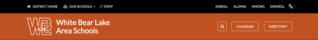
When writing your CTAs, pretend you are a visitor. Ask yourself: “If I had never been to this website, would I know where this button (CTA) would take me?” For example, White Bear Lake Area Schools has a clear CTA for enrollment. Visitors who come to the website know that by clicking on ‘Enroll,’ they will be taken to the registration page.
Simple Website Navigation
The best way to get website visitors to browse your site is to make it easy for them. For example, if you run an e-commerce website, you probably wouldn’t label your checkout as ‘Leave’ or ‘Exit.’ Instead, you may simply use ‘Checkout,’ ‘Place Order,’ or ‘Complete Purchase.’ All of these terms clearly state what users can expect should they click that link.
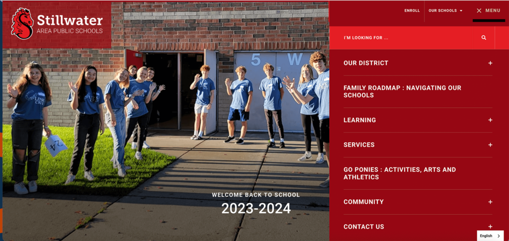
And just because you need to use clear, obvious language does not mean the navigation has to be generic. Like Stillwater Area Public Schools, you can choose words that coincide with your brand yet still make navigation easy to understand. For instance, instead of ‘Education,’ you could use ‘Learning,’ ‘Instruction,’ or ‘Academics.’ And ‘Services’ is more customer-centric than “Departments.’
Tip: Ashley Winter, CEL’s Content Marketing Coordinator, emphasizes the need to make sure that the words you choose can be easily translated into other languages. “The last thing you want to do is choose a word that doesn’t translate well. You run the risk of multilingual learners having difficulty navigating your website,” she says.
Not everyone has the time (or patience) to browse through your entire site to find what they’re looking for. It’s important to incorporate an on-site search — like Stillwater’s “I’m looking for…”— that lets your visitors search for precisely what they need. They simply type in their question, and they’re directed to the right page. This streamlined approach enhances user experience (UX) and encourages visitors to explore your website further.
Links to Popular Pages and Resources
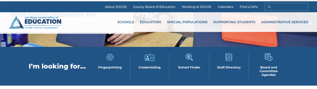
Use analytics to determine the most commonly visited pages and make sure they are only one click away from the home page by providing direct links. For individual schools, the most commonly searched pages might be calendars, lunch menus, and school supply lists. For school district webpages, like San Diego County Office of Education (SDCOE), the most common resources may be, credentialing, school finder, staff directory, employment and fingerprinting, and school board agendas. Because these resources are so common, SDCOE has placed them directly on their homepage.
Quickly identify your most visited pages using tools like Google Analytics (GA4) or other data analytics platforms. However, overloading your homepage with resources may overwhelm users. As a general guideline, aim to feature only five key resources on your homepage.
Incorporating these five key elements into your homepage content can transform your website into a user-friendly, engaging, and persuasive platform. Whether you’re aiming to attract prospective students, customers, or clients, your homepage serves as the gateway.
Looking to build homepage content that truly hits the mark? Contact the CEL team, we’re ready to help!
Published on: October 9, 2023