Website Practices to Leave Behind
The final month of 2020 is drawing to an end. As you create your New Year’s resolutions, evaluate the website you want to have in 2021. And also, consider five website design practices to leave behind in 2020 and what you can be doing instead.
Larger Headers
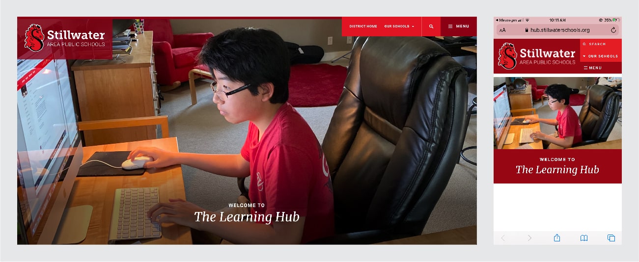
Website design has shifted fully to mobile-first, and your headers should create a consistent experience for all users. A phone screen, obviously, has limited space. If your header is taking up the majority of that screen, your user misses out on important information at a first glance. Use slender headers and navigation design.
Examples of fluid, responsive headers:

Stillwater Area Public Schools

Above the Fold Mentality
Better user experience on a website is more about paneling and clean consistency. Users access your website from multiple devices, and “the fold” is different on every device. With our current scrolling and scanning society, each thumb flick should be a new panel of information. To minimize frustration with your site, focus on scrolling instead of linking and switch pages only when truly necessary.
What content do you want visitors to see first on your website? Is that the first information you see? If the answer is no, consider switching that content with your most important message.
Long Paragraphs of Content
Your audience gets overloaded with information on the internet every day. Tighten your writing to grab attention and get your message across efficiently. In terms of words per paragraph, less is more. Use paragraph structure to call out essential information so it is easily spotted.
Consider including the estimated read time at the top of your page/piece. Plug-ins can estimate the read time, and you can use that as an indicator of your writing efficiency. Read-o-meter is a good tool for read-time estimation. Iris estimates the average reading time for adults is between 200 and 250 words per minute. This can vary for readers who are not primarily English speaking. Adding imagery or translated content will help all of your readers get the information.
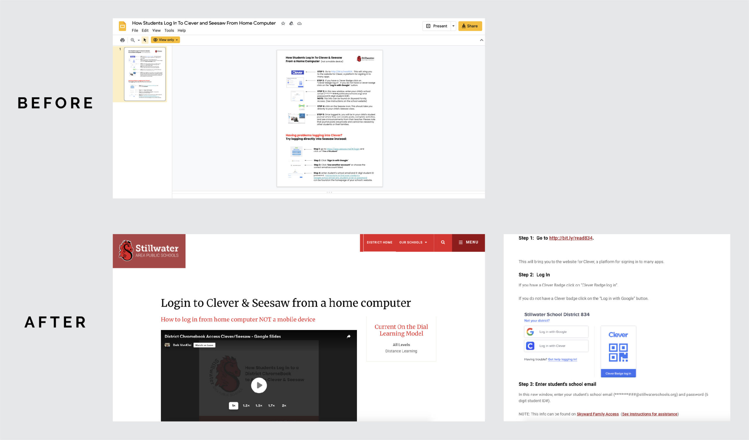
Links to PDFs or Google Docs for Tutorials or Help Guides
Users should have a consistent experience when accessing your website from multiple devices. PDFs are not fully responsive and create a harsh user experience on mobile devices. Documents and PDFs are meant to be print-based, not web-based. They also are not ADA (Americans with Disabilities Act) compliant if they lack alt text.
Broken links are common when using Google Docs or PDFs, and you may not realize it’s a broken link when you’re editing or modifying a document. Did you know that Google doesn’t crawl your Google Education Suite for search, so external users often experience frustration.
Another way to provide tutorials on your website:

A Webpage Layout That Is Print Focused
One size does not fit all in website design. Remember users access your site from multiple devices — tablets, smartphones and desktops. A website designed for desktop usually creates an inconsistent user experience.
For example, directional language will confuse visitors. Using the phrase “to the right” will not be accurate when you shift from laptop to mobile. Your site can shift as screen sizes do, and information can be difficult to locate with the use of directional language. As long as you have a fully responsive site, it will respond to all models. Avoid directional language and be sure to consider all user devices when designing your site.
Inconsistent Location for Your “Translate” Button
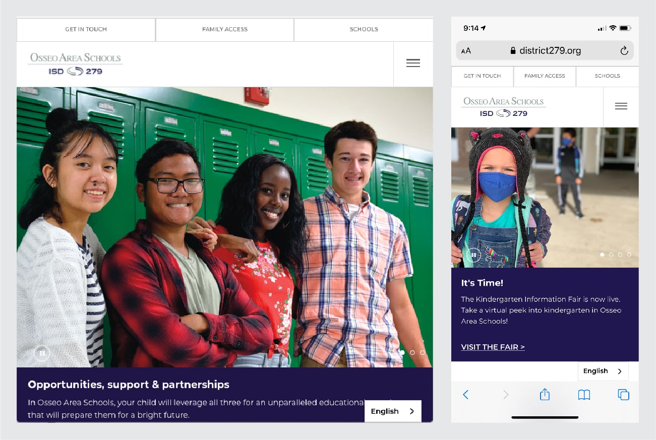
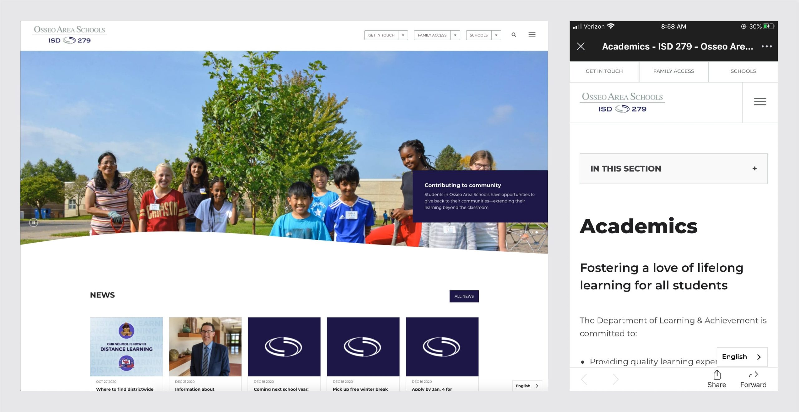
A consistent location for the translate button will help users access your information. Intentionally position your translate button for multiple devices.
Example of easy accessibility through different devices:

Website design and practices evolve over time. If you’d like to find out what we’re seeing and how we’re advising our clients, schedule a free consult.
Book a Free Consult
Published on: December 28, 2020