In today’s digital world, a growing reliance on mobile devices underscores the importance of optimizing websites for mobile access. Whether through mobile-first design, which prioritizes the mobile user experience, or responsive design, which ensures adaptability across different devices, websites must cater to a mobile audience to remain competitive and user-friendly. Understanding the distinction between mobile-first and responsive design is the first step to making informed decisions when updating your website.
Chelsa Janke, vice president of integrated marketing at CEL, believes, “Designing a website is like crafting a tailored suit; it should fit the user’s needs perfectly, whether on a phone or a desktop.”
What is Mobile-First Website Design?
Mobile-first involves beginning with the mobile version of the site and then adapting it to larger screens, contrasting with the traditional approach of starting with a desktop site and adapting it to smaller screens.
Mobile-first website design emphasizes simplicity and efficiency, featuring clean layouts, easily readable text, and intuitive navigation tailored for touch interaction. This approach ensures a seamless experience for smartphone and tablet users by prioritizing essential content and optimizing mobile loading speeds.
With most people using phones to browse the web, mobile-first is the better approach. It ensures your website is user-friendly for the most common way people see it.
“In web design, flexibility is not just a feature—it’s a necessity. A mobile-first approach ensures we’re always ready to meet users where they are,” says Andrew A. Hagen, integrated communications coordinator at CEL.
What is Responsive Website Design?
Responsive website design creates websites that look good on all devices, whether you’re using a smartphone, tablet, or desktop computer. This approach makes sure that the layout, font size, images, and other elements change automatically to fit the screen size, providing a good viewing experience on any device.
A mobile-first website is always responsive, but a responsive website isn’t always mobile-first. — Leah Mangold, Finalsite Content Specialist
In responsive design, the website layout is flexible. As you change the size of your browser window or switch devices, the website’s content adjusts to stay user-friendly and visually appealing. For example, on smaller screens, navigation menus might turn into a hamburger menu, images might shrink to fit the screen, and text might get bigger or smaller to stay readable.
Mobile-First vs. Responsive Websites: Key Differences
While both mobile-first and responsive websites adapt to different screen sizes, they prioritize design and content differently.
Mobile-First Website:
- Simple, Clean Layout:Prioritizes a straightforward design with easy-to-read text and large, tappable buttons optimized for touch interaction, reducing clutter and ensuring faster loading times.
- Streamlined Content:Prioritizes essential information tailored for mobile users (less is more). Images and videos are optimized for quick loading using efficient formats and small file sizes.
- Google’s Default: Google now defaults to mobile-first indexing, underlining the importance of prioritizing mobile-friendly design for better search engine performance.
- Features:
- The hamburger menu is available on both mobile and desktop.
- Linked phone numbers offer one-tap calling and texting.
- The hamburger menu is available on both mobile and desktop.
- Linked phone numbers offer one-tap calling and texting.
- Example: Finalsite Greenwich theme
Responsive Website:
- Adaptive Layout: Adjusts the layout to fit different screen sizes, which may involve hiding some content on mobile or stacking elements differently.
- Consistent Content: Offers the same content on all devices but presents it differently depending on the screen size; for example, text might be broken into columns on mobile, and menus might collapse to save space.
- Implementation and Accessibility:
- Easier and faster to implement initially.
- Ensures website accessibility across all devices, although the experience may not be optimized for each device.
- Example: Finalsite Bethel theme
“Content is king, but context is its kingdom,” says Ashley Winter, content marketing coordinator at CEL. “Whether it’s a mobile screen or a widescreen monitor, our content should shine brightest where it’s viewed.” When designing your website, be sure to view pages from both a desktop and mobile perspective. Is this information and the impact of your content the same across both experiences?
Designing for Your Website Users
Designing a website that works well for all screen sizes, from small mobile devices to large desktop monitors, is like designing office spaces that can accommodate different company sizes.
A mobile-first approach is like designing an office space prioritizing mobility and flexibility, with a focus on laptops and tables. Imagine standing desks with small footprints, ergonomic chairs for short work sessions, and collaboration areas with movable furniture. This setup would be perfect for a small office or co-working space. However, it could also be adapted for a larger office by adding more dedicated workstations or separate work areas as needed.
Responsive web design is like having an office with modular, adjustable furniture. The desks can be folded or stacked to save space, chairs can adjust for different user heights, and partitions can be moved to create smaller or larger workspaces as needed. This flexible setup can function in both a small office for a startup or a large corporate headquarters, adapting to the available space.
In both cases, the idea is to create a design that can adjust and scale to different requirements and constraints rather than being limited to a single, fixed configuration.
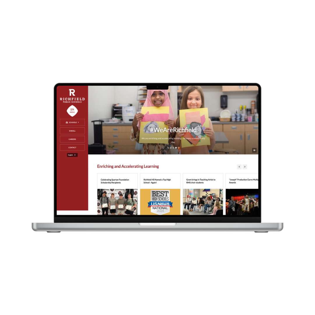
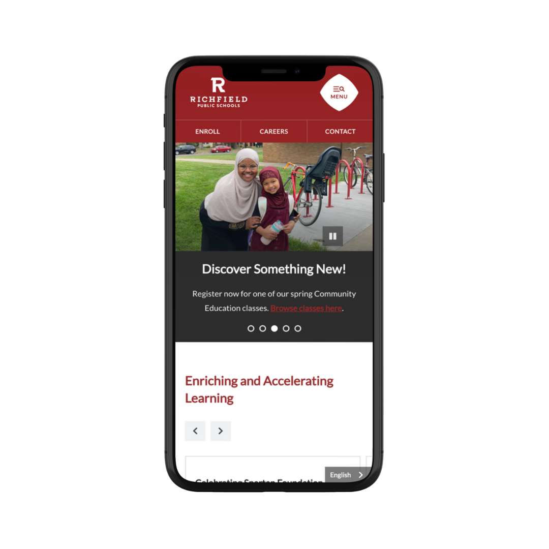
Richfield Public Schools took a mobile-first approach to website design. With more than 65% of their traffic coming from smartphones, their site is easily navigable on mobile devices. Notice that the hamburger menu is consistent on desktop and mobile; the most high-traffic pages and necessary information are at the user’s fingertips. Mobile-first also prioritizes search as the first item on the menu with “What can we help you find at Richfield Public Schools?” Finally, a sticky language translation button is available on mobile devices.

