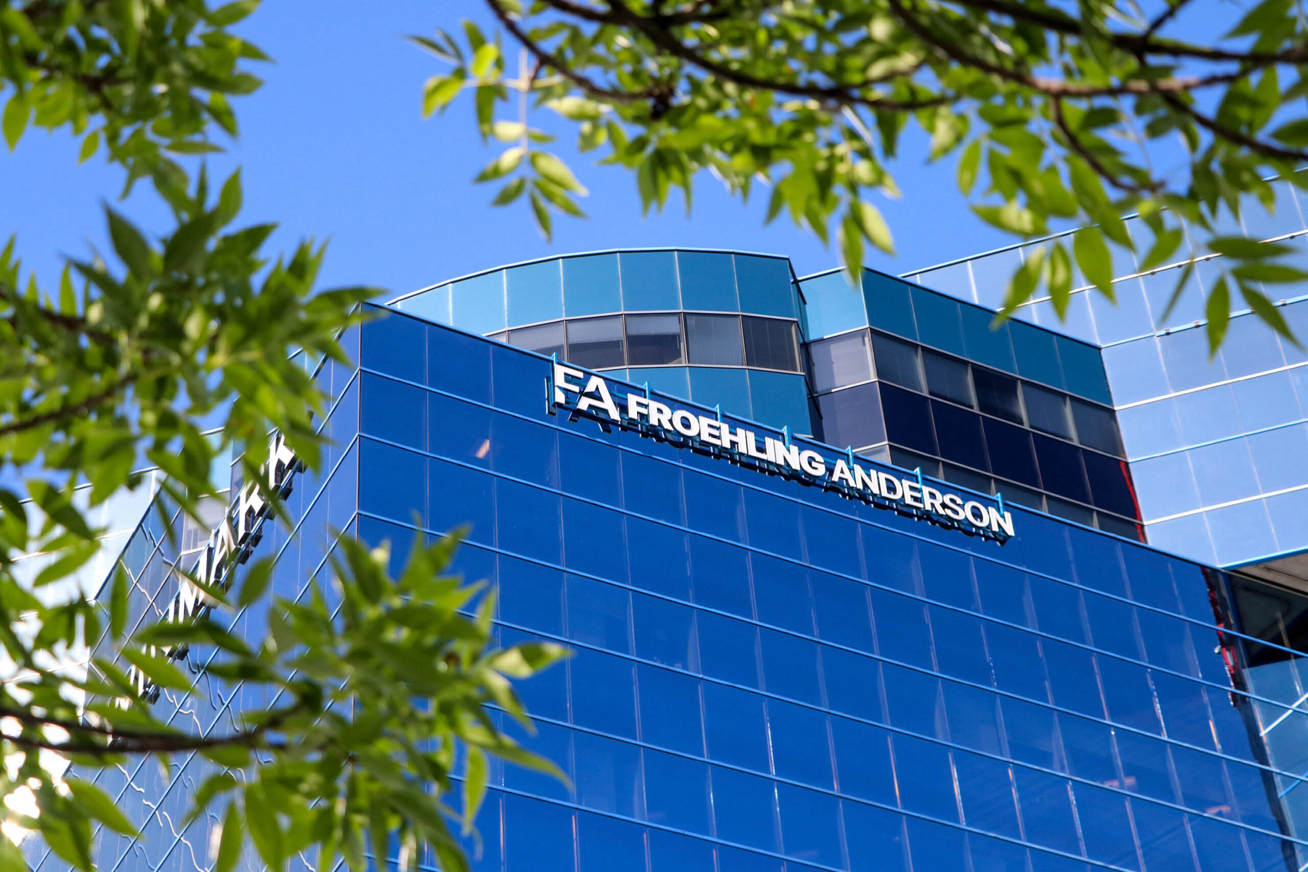

FROEHLING ANDERSON
Modernizing a CPA Brand Without Losing Trust
For decades, Froehling Anderson built trust quietly. The next chapter of the business called for a brand that could speak a little louder.
For nearly 80 years, Froehling Anderson has supported business owners in their accounting, tax, and consulting decisions. The independently-owned CPA firm has a reputation for forming strong relationships that puts people first while delivering solid guidance.
The way people find, evaluate, and connect with professional services has changed over the last decade, even over the last few years. Potential clients are researching firms online rather than relying on word-of-mouth referrals. Future employees are now assessing companies on workplace culture as much as the reputation or work standards. While the traditional perception of CPAs is quiet and more “backroom” professionals, Froehling Anderson looked to infuse warmth and energy into their advisory experience.
Turning Quiet Trust into Visible Confidence
Froehling Anderson’s expansion brought its future into sharper focus. With a relocation underway, a new Saint Cloud office opening, and a milestone anniversary approaching, FA partnered with CEL to refresh the brand for what came next.
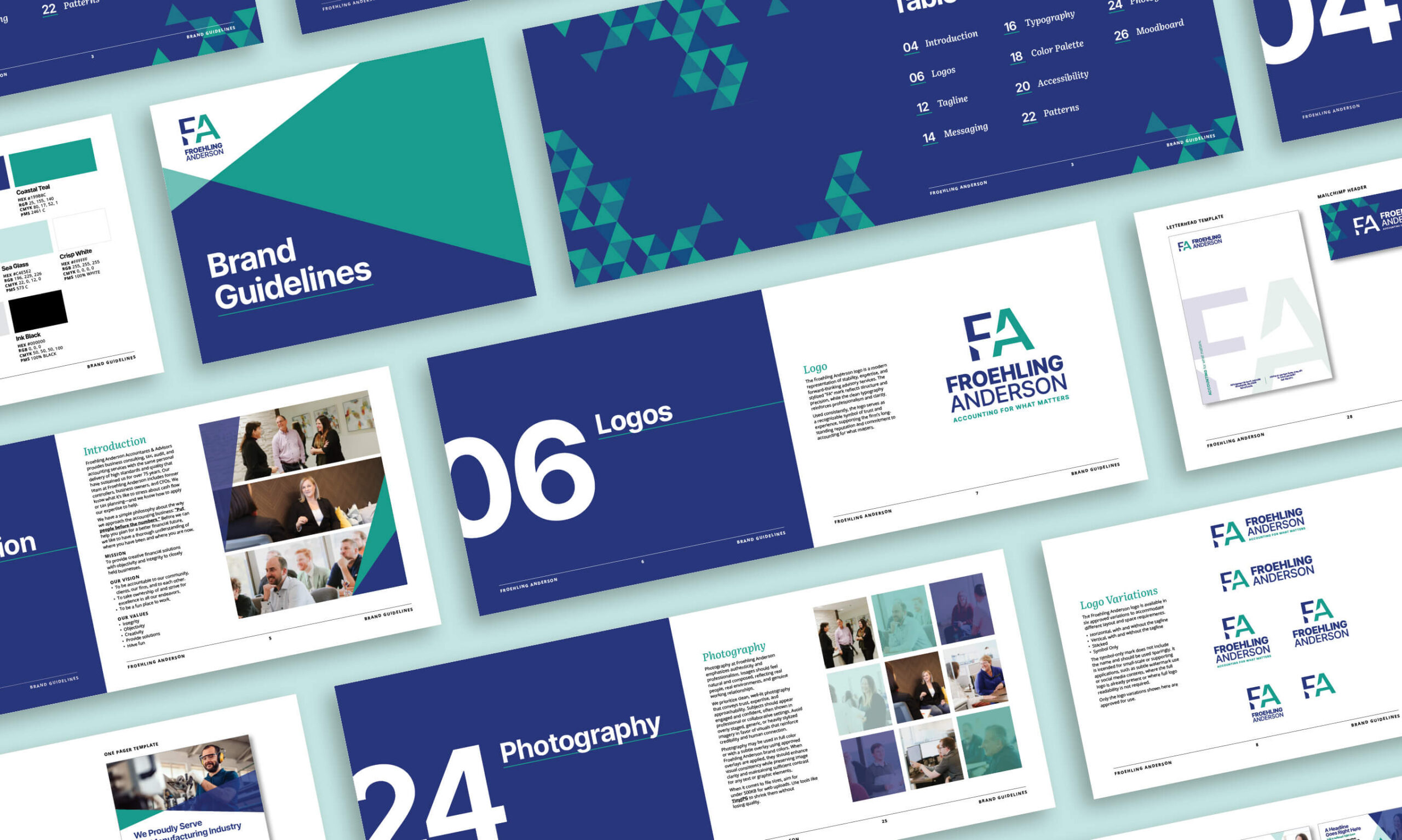
Rather than reinvent the firm’s image, CEL refreshed the FA brand to better reflect who the company already was—established, professional, and approachable. This allowed the brand more room to work across everyday materials, from client conversations and proposals to recruiting, digital marketing, and a growing physical presence.



A Stronger Mark for a Familiar Name
CEL refined the logo to make the FA acronym more obvious and simpler to use across applications. The updated mark directly connects to the triangle shapes used throughout the brand, creating a stronger visual identity for new audiences while preserving familiarity for long-term clients.
Making Professional Feel More Personal
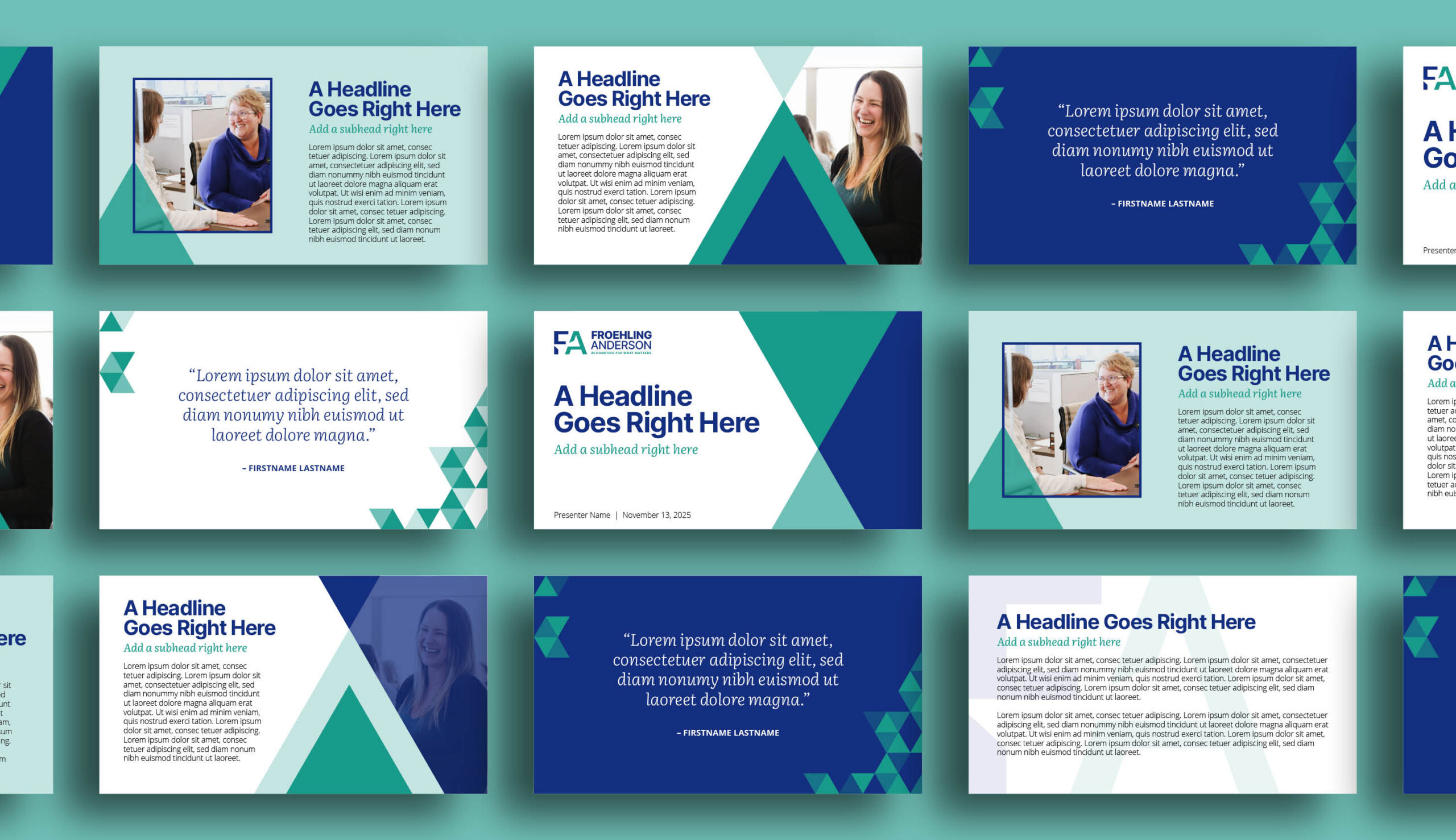
Froehling Anderson’s previous color palette relied primarily on navy and grey. While, on the outside, it appeared professional, it did not leave much space for energy or the approachability the firm wanted to show. CEL kept navy as an established anchor for trust and brought green from an accent color to a more prominent role within the brand. The shift gave FA’s visual identity a fresh edge and more versatility across marketing applications, while still giving FA the authority that clients expect from a CPA firm.
The refresh also gave FA’s geometric elements a larger role in the visual brand. Rather than relying on a single pattern or fixed design elements, CEL expanded the angular shapes into a more flexible toolkit designed to amplify visual interest across different materials.
From digital ads and recruiting pamphlets to client-facing portfolio materials, the added visual range carried much of the brand’s personality in places where the logo could not. The elevated palette and triangular brand elements gave FA more energetic ways to show warmth while keeping the overall brand recognizable and grounded.


“Approaching our 80th year in business with a future office move, it was time to give our brand a refresh. We had no hesitations trusting CEL—their team of professionals took the time to listen to our leadership’s creative ideas; understand our brand and the integrity we wanted to maintain within that; and preserved all the elements we wanted to keep, while introducing new concepts. The partnership between our leadership team and theirs was cohesive and smooth, and I would entrust any big branding update or refresh to them.”
~KAILA YIM, MARKETING MANAGER



Accounting for a Message That Matters
FA had always believed in putting people before the numbers, but that idea needed supporting language and specificity to stand apart in a crowded professional services space. In accounting, many companies use similar language around relationships, trust, and top-notch customer service. CEL helped FA elevate their longstanding internal philosophy into client-facing messaging that felt ownable and true to the way the firm works, and their clients expect.
The new tagline, Accounting for What Matters, is a subtle play on words that combines FA’s work and values into one message. It speaks to the firm’s accounting expertise while bringing the people, goals, and decisions to the forefront. For clients, it reinforces FA’s core goals: thoughtful guidance, practical support, and a solution to complex financial questions.
To support the tagline and overall brand, CEL developed three key message pillars:
-
- Putting People Before Numbers focuses on listening first and understanding each client’s goals before diving into the spreadsheets.
- Insight That Moves You Forward positions FA as an advisor who helps clients understand what their numbers mean and what to do next.
- A Steady, Trusted Partner reinforces the calm, reliable support clients can expect through business changes, market shifts, and everyday decisions.
Together, these messaging pillars and core brand elements give FA written language that matches the experience clients already come to expect with the firm—a practical, knowledgeable, and deeply invested group of people behind the numbers.
Built for the Next Chapter
For Froehling Anderson, speaking louder did not mean changing its voice. It meant bringing more of the firm’s character to the surface—the relationship-driven guidance clients rely on, the practical experience behind complex decisions, and the trust shaped by nearly 80 years in business.
As FA steps into a new location and a new market, the refreshed brand gives the firm a stronger presence without losing sight of where it started. From visual identity to key messaging, it carries forward what clients already value while giving new audiences a clearer reason to take notice—a natural next step after CEL’s earlier work modernizing Froehling Anderson’s recruitment marketing and employee storytelling.