LINCOLN-WAY COMMUNITY HIGH SCHOOL DISTRICT 210
Unifying a District Through Design
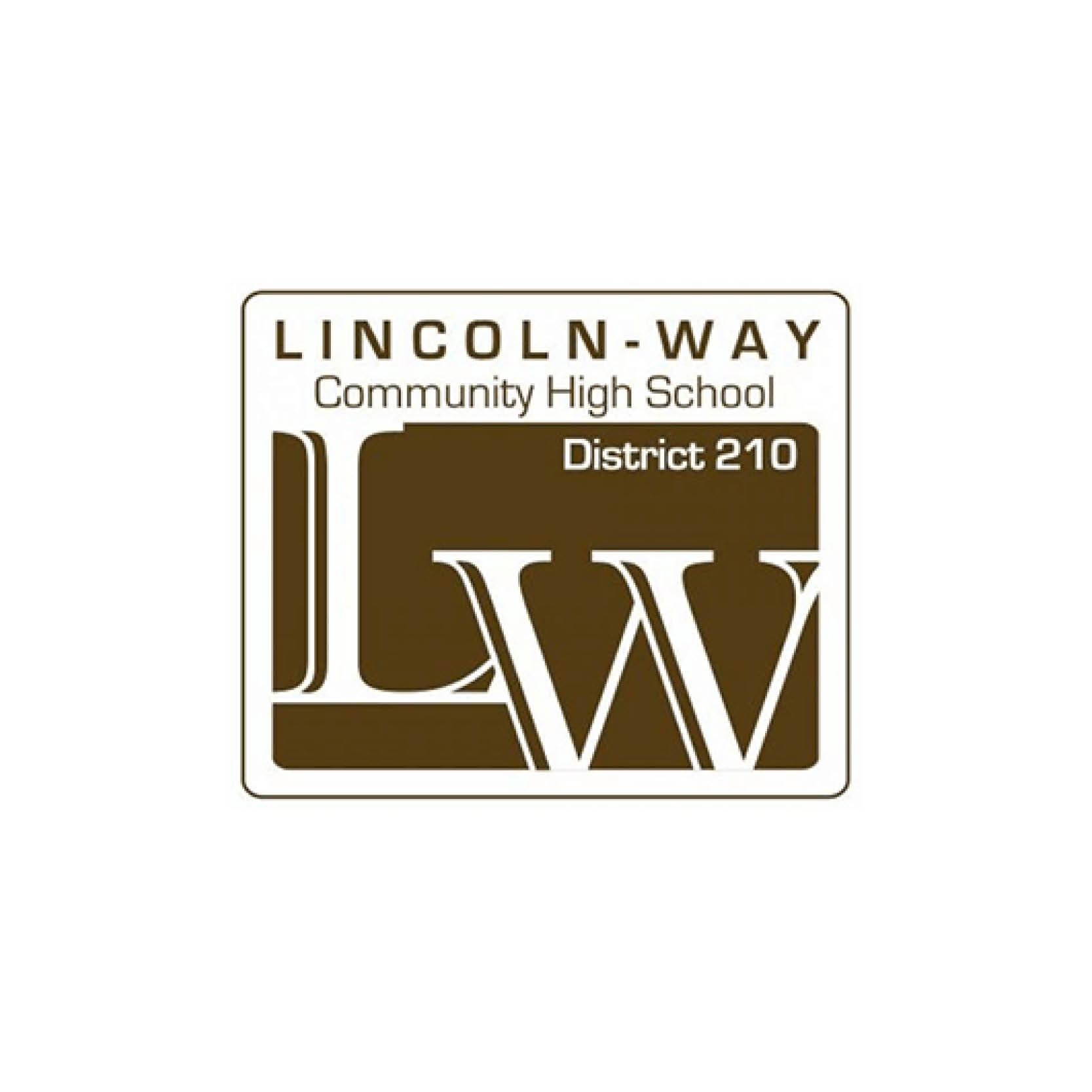
Lincoln-Way Community High School District 210 is uniquely positioned as a district that serves grades 9-12, with three high schools. While each high school thrived with its own individual brand and deep community pride, the district identity lacked the same excitement and cohesion. The district’s old brown logo felt outdated and disconnected from the schools’ vibrant energy and needed a refresh. Staff and students avoided using the district brand because it didn’t reflect their identity. As a result, Lincoln-Way turned to CEL to update their brand to better reflect the enthusiasm, school spirit, and academic excellence—while respecting each school’s individuality.
Lincoln-Way Community High School District 210’s rebrand earned an Award of Excellence in the Branding/Image Package category at the 2025 Illinois School Public Relations Association (INSPRA) Communications Awards.


Balancing Pride and Representation
One of the biggest challenges was balancing the pride and individual spirit between the three high schools, making equal color representation a priority. Each school had a distinct color palette and style, adding a layer of complexity to the brand refresh. The district aimed for a collegiate, future-focused look that better reflected its high school–only identity and college-prep mission. CEL collaborated with district leadership to untangle the existing brand, internal dynamics, and unique culture and community pride that define Lincoln-Way.
Developing the Brand Strategy
The Visual Identity
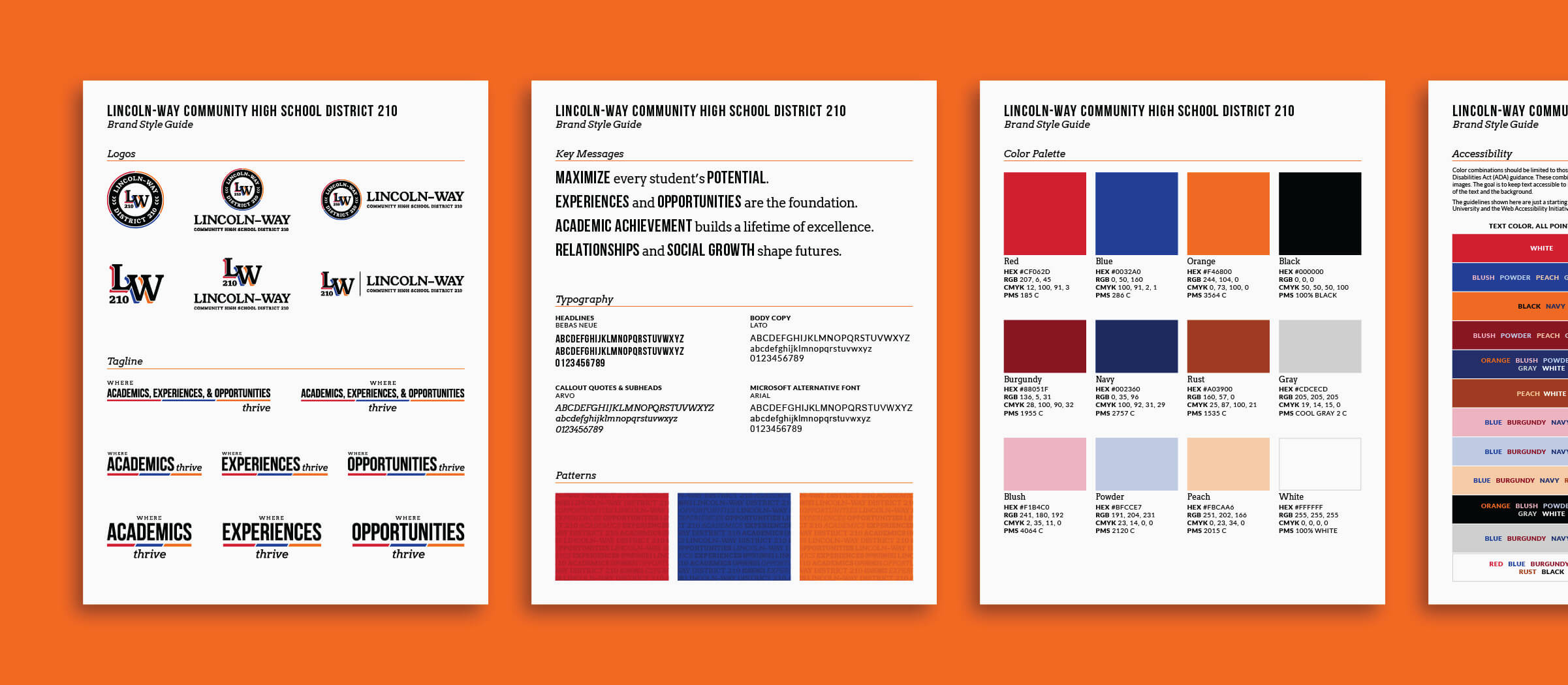
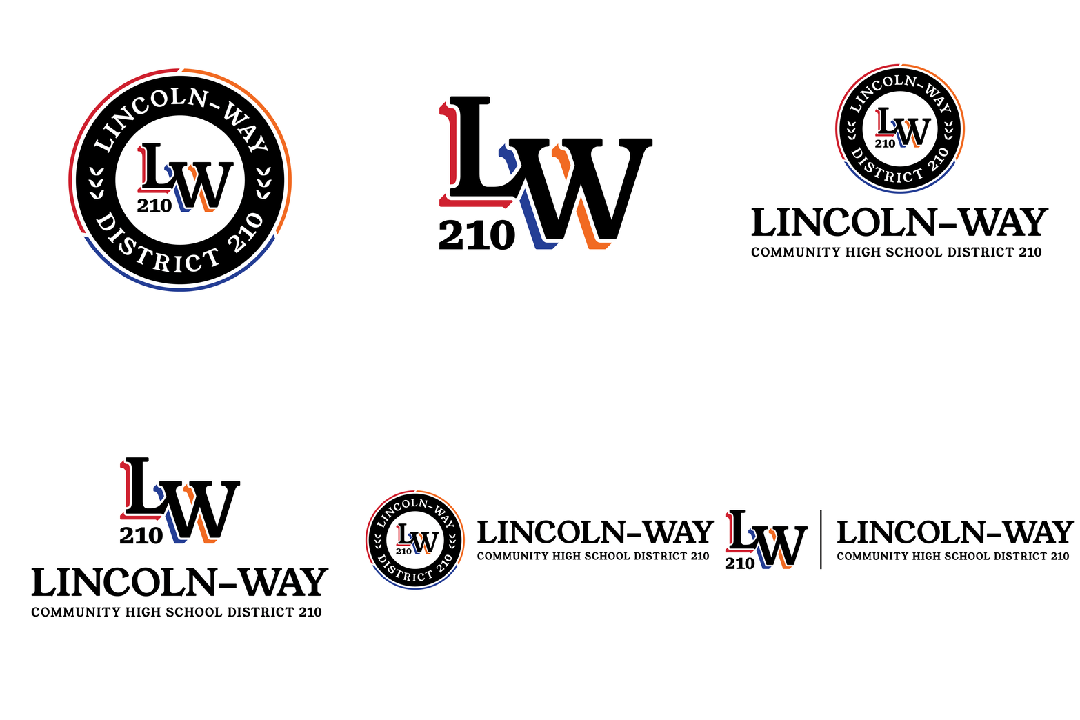
CEL designed a badge-style logo to capture the district’s academic credibility and collegiate spirit, using all three school colors equally to symbolize unity and pride. To complement the primary mark, CEL also developed a simplified “LW210” version, giving the district flexibility across uses—formal applications like official documents feature the full badge, while the streamlined symbol appears in athletics and student-focused materials.
To ensure consistency and accessibility across digital and print, CEL refreshed the color palette for greater vibrancy and added coordinated tints and shades to enhance flexibility. The result is a modern, collegiate identity that unites the district under a single, enduring look reflecting the energy of its students.
BEFORE
AFTER

Tagline & Messaging
To complement the new visual and logo, CEL refreshed the tagline and key messages. The core messages capture students’ voices and reflect the district’s values. The tagline’s words were transformed into a pattern system that incorporates the district’s name throughout, creating a strong link between its identity and story. The updated messaging and modular tagline work across multiple contexts, allowing phrases to stand alone for different audiences. The flexible design system connects athletics, arts, and academics under one cohesive district brand.
"I want to thank you all for your work and support on this project – we have received nothing but positive feedback on the new brand and it has made my job so much easier."
~JEN VUJOSEVIC, Director of Community Relations

Bringing the Brand to Life
Defining the new brand was only the beginning—CEL worked alongside Lincoln-Way to bring it to life across the district. From digital displays and district signage to print materials and school events, the new identity delivers a consistent, energizing presence. Staff and students have welcomed the refreshed look, proud to represent both their school and the larger Lincoln-Way community.
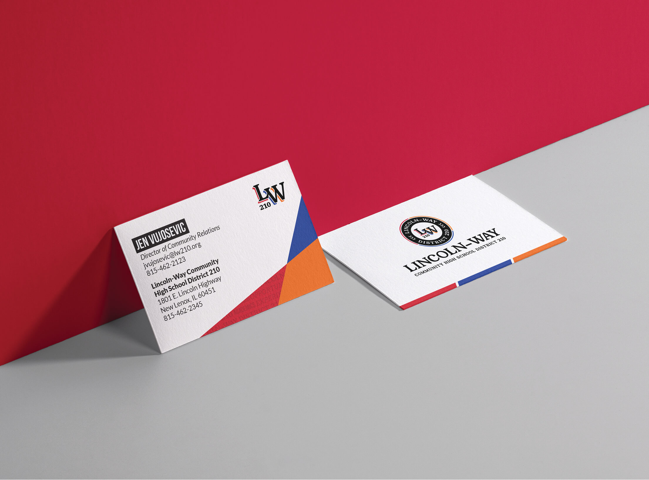
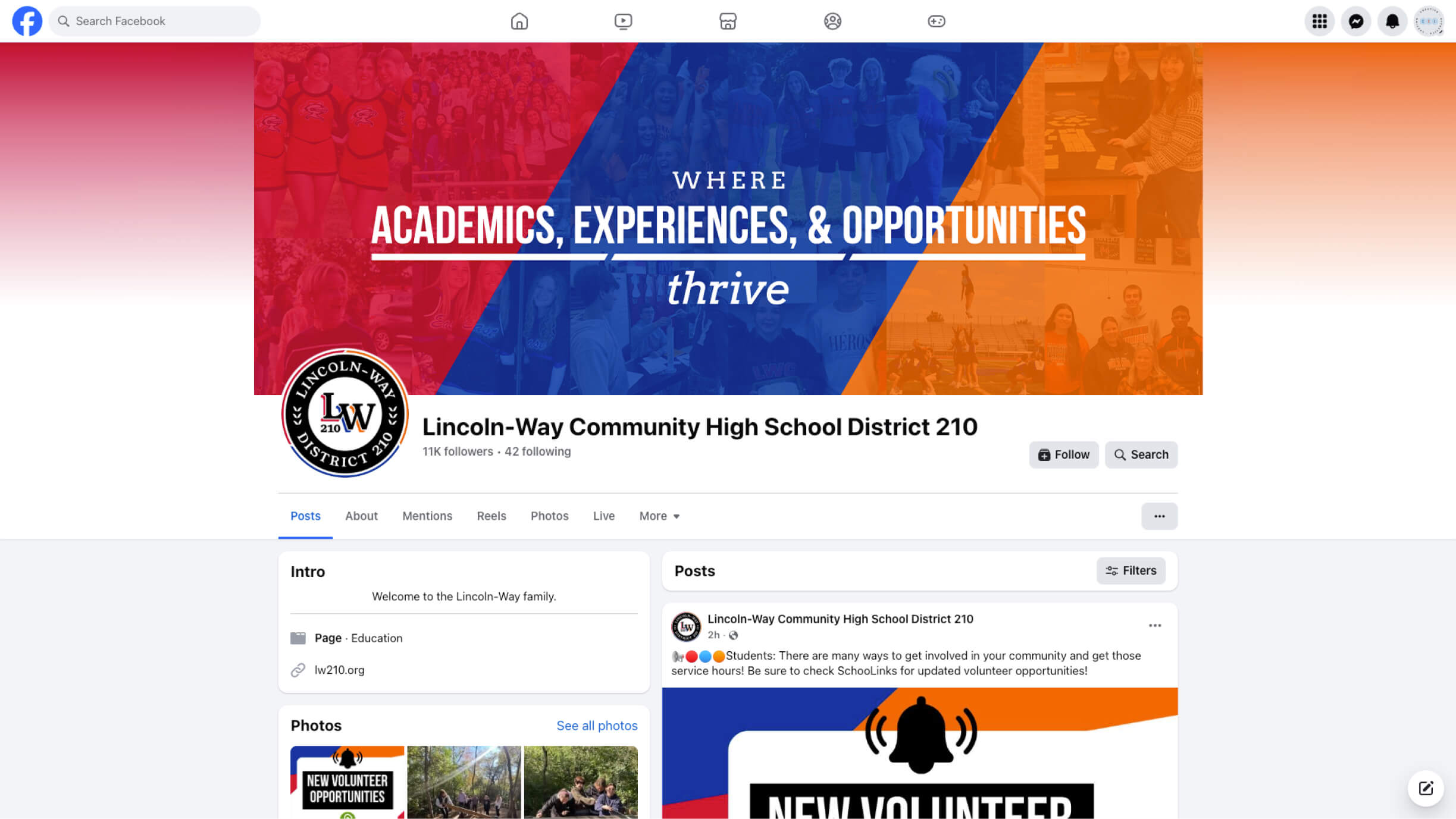
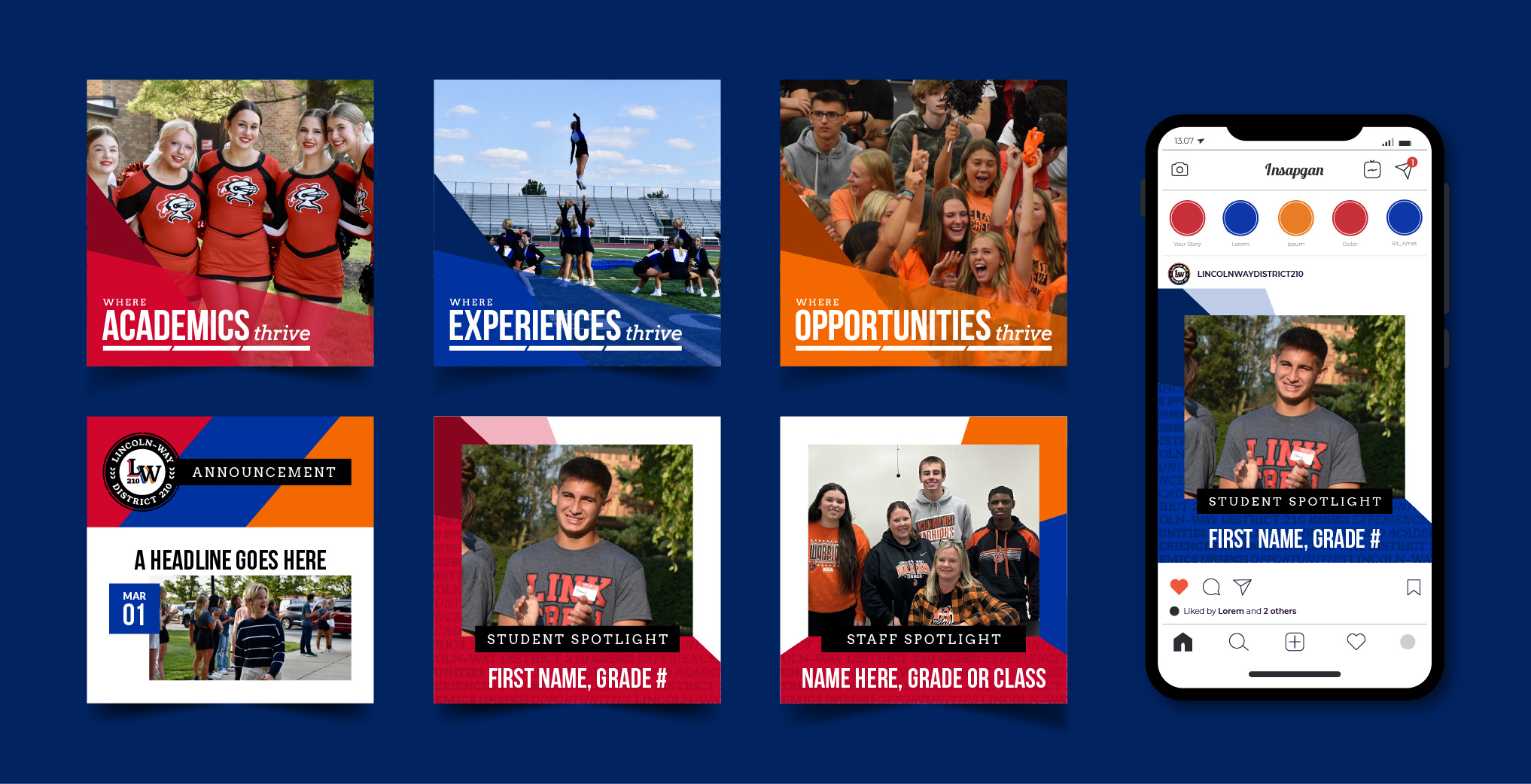
Lincoln-Way’s new cohesive visual identity simplifies communication and makes applications more accessible and consistent across schools. The district now presents a unified story—one that reflects its strong academic reputation and community connection.

