Brand Refresh for Robbinsdale Area Schools
More than 12,000 students from preschool through Grade 12 attend Robbinsdale Area Schools. They represent seven different cities within the district, as well as nearby communities.
Robbinsdale Area Schools partnered with CEL to refresh its brand identity system to better reflect the vibrant, dynamic nature of the students and families it serves. CEL’s design team first expanded the color palette and from there developed new patterns, typographic options and templates (flyers, presentation decks and more) to deliver more coordinated and visually striking communications. The broader color range supported and maintained a cohesiveness throughout the many individual school sub-brands within the district.
The brand refresh extended to the district’s website as well. The Robbinsdale team took advantage of the third stage of the lifecycle of a school website — Enhance — by incorporating the expanded brand identity system into the website for a more effective user experience and functionality.
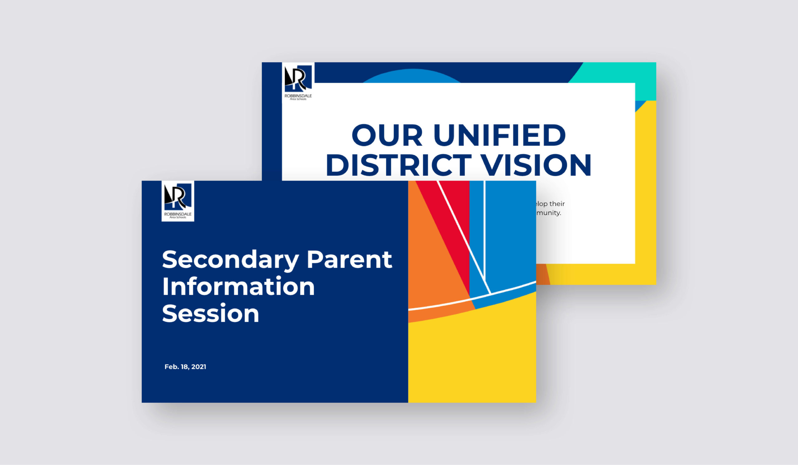
CEL created presentation templates using the updated brand identity system, featuring the expanded color palette and new patterns.
The shape of the capital R in the existing logo provided inspiration for the movement and color fields in the new graphic backgrounds.
To make it easy for schools to use the files, all templates are accessible in Google documents or slides. School principals and office staff participated in marketing training. A master spreadsheet links all files by school for the district team, and the district print shop is the custodian of the original design files.
District marketing assets included:
• Brand style guides (2) and logo files
• Digital and print brand package (stationary, email signatures, greeting cards, business cards, slide deck)
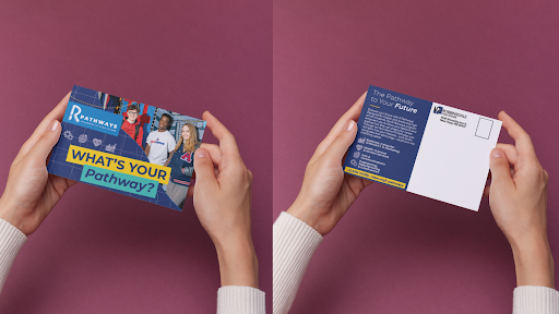
• Marketing and event postcards, posters, fliers
• Back-to-School newsletter and District newsletter template
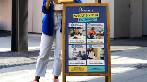
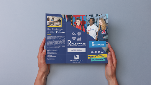
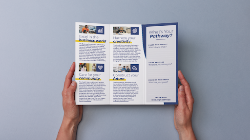
• School Pathways presentation, website and marketing materials
• Electronic newsletter mastheads: District, schools and DEI
• Kindergarten marketing materials
• Social media templates and digital ads (search and social)
• Pop-up banner (events), step-and-repeat banner
Each of the 22 schools and programs received:
• Digital and print letterhead, email signatures, business cards, envelopes, master slide deck
• Logos and graphic patterns (six file types, five color variations, print and digital files)
• Templates for posters, flyers, certificates, thank you notes, postcards
• School fact sheets, newsletter masthead, templates and training
• Marketing toolkit with instructions and hyperlinks to access all resources
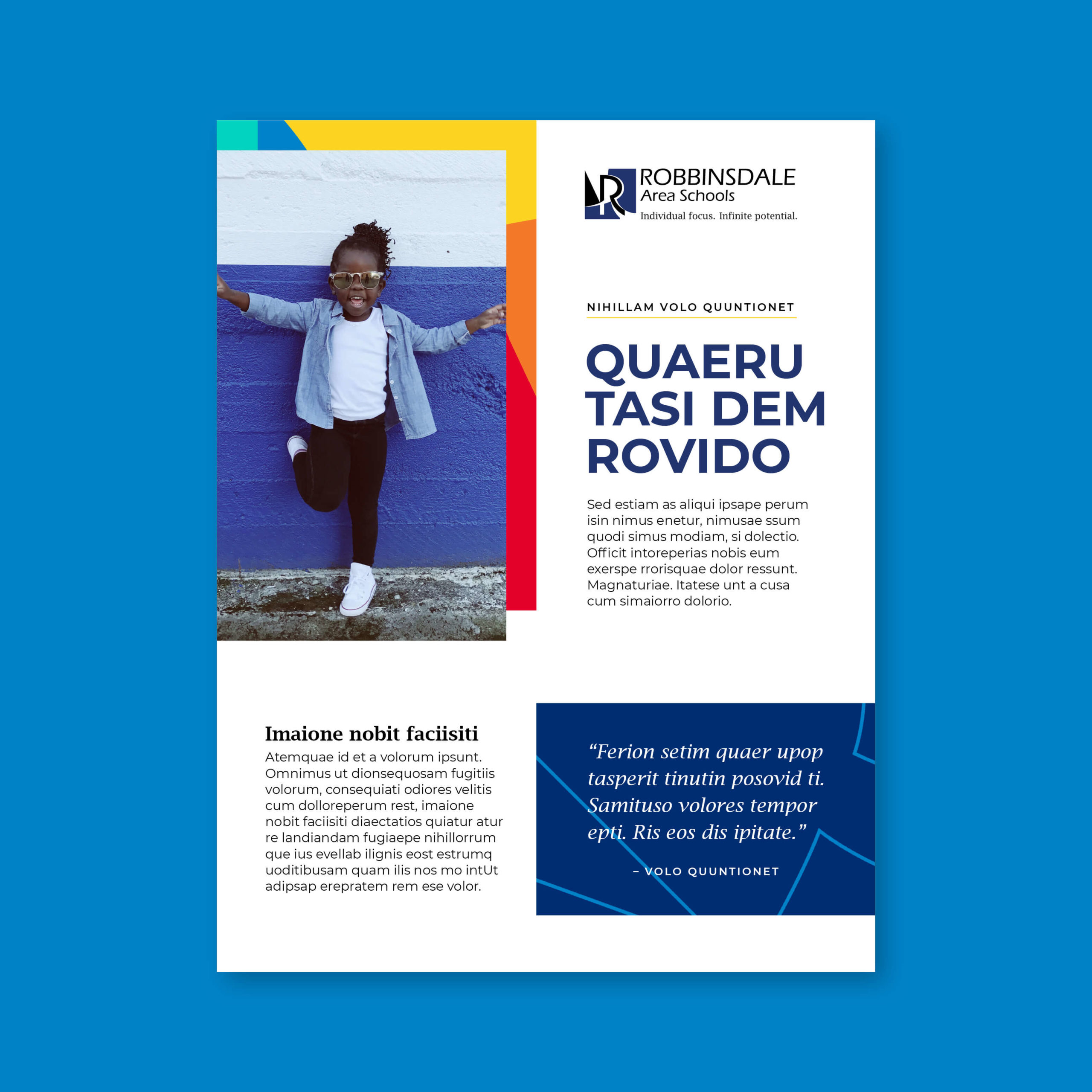
CEL also developed flyer templates for print and digital communications, using the pattern as a framing device for photography.

Enrollment marketing for Robbinsdale schools included animated GIFs built from images of students of all ages in the district.
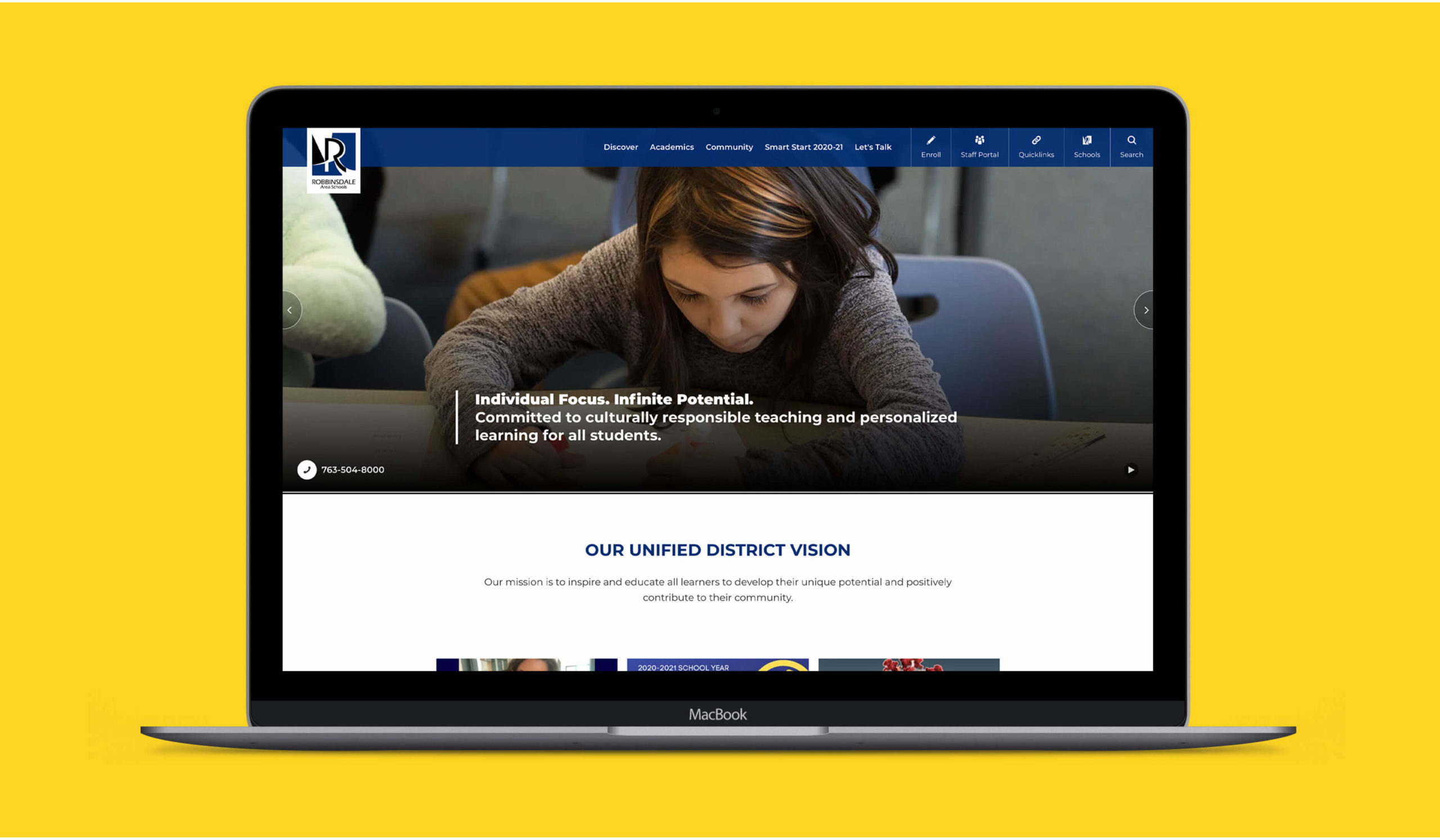
In addition to reinforcing consistent messaging for the Unified District Vision, CEL incorporated navy blue as a core color district-wide.
Expanding beyond the confines of district materials, Pathways emerge as integral components across all schools within Robbinsdale Area Schools. This expanded brand not only highlights the vibrancy of each individual school but also places significant emphasis on the educational journey over the singular needs of any one institution. Through a comprehensive array of materials, including brochures, web landing pages detailing course types, and eye-catching postcards distributed to showcase the breadth of Pathways options, our district has undergone a revitalization that places student pathways at the forefront of our educational mission.
