OSSEO AREA SCHOOLS
A Clearer Path Forward: Osseo Area Schools Brand Refresh
A strong school district brand should reflect the people it serves. The former “District 279” name and link-shaped logo didn’t reflect the energy or diversity of the three cities Osseo Area Schools serves. Families struggled to connect with a look that felt impersonal and inconsistent. To address this, CEL worked with the School District Cabinet and the Community Relations and Communications team to reimagine the brand. Together, they set clear priorities: a logo with energy and meaning, refreshed colors with greater accessibility, and a design system that could unify the community and set Osseo apart.

Logo with Meaning
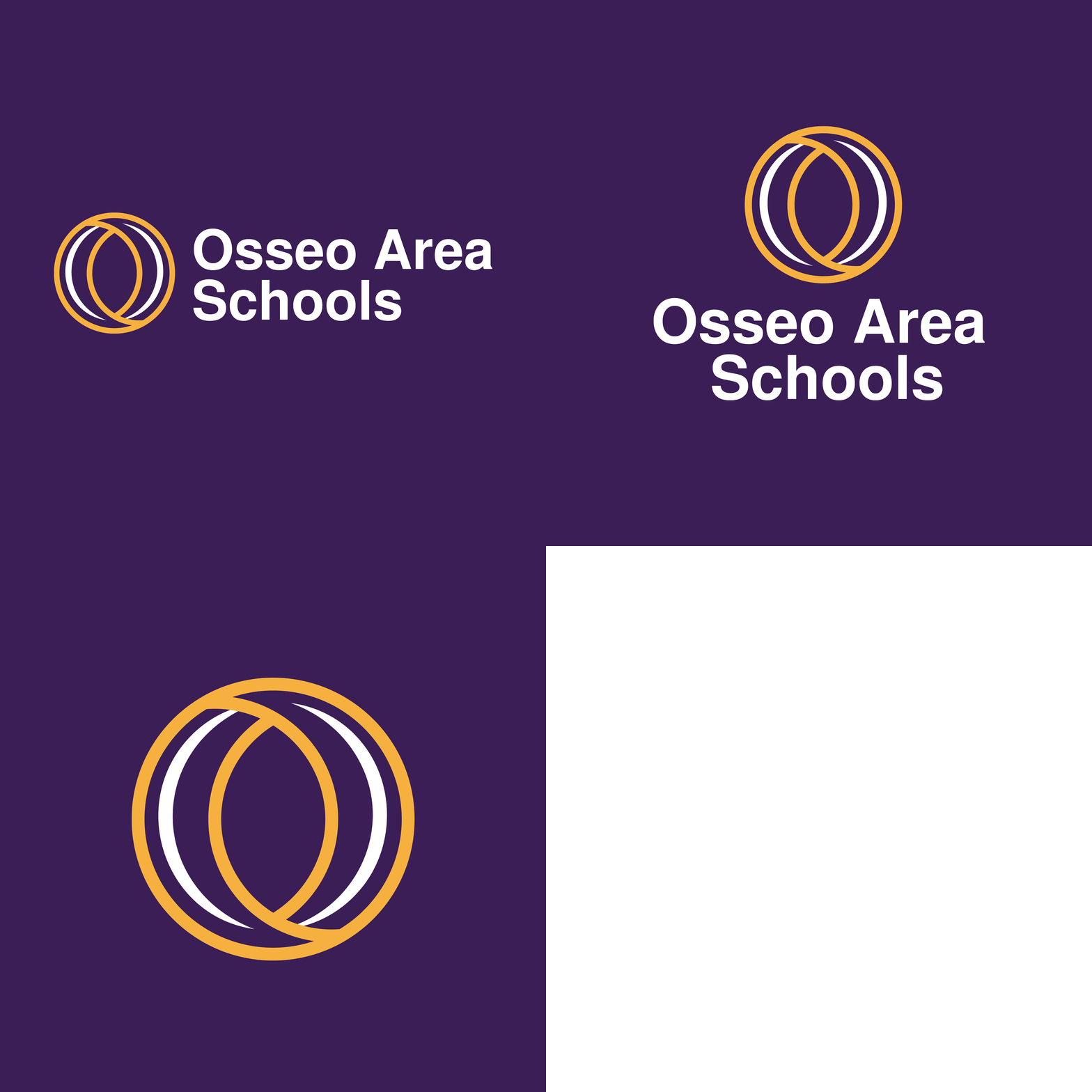
The new Osseo Area Schools logo is more than a mark, it’s a symbol of unity and pride.
The circular “O” suggests connection, momentum, and the lifelong learning journey that begins in Osseo Area Schools and extends beyond graduation.
At its center, a subtle “eye” embodies the district’s promise to see and support every student, staff, family, and voice in the community as a whole.
From banners to apparel to digital platforms, the updated design gives Osseo Area Schools a clear, recognizable look that families can take pride in.

"I loved the process! You come from such a different point of view that allowed people to talk and be engaged. You think outside the box and I love that. I got a little emotional on the inside about how you hit who we are right from the start. Thank you!"
~DR KIM HIEL, SUPERINTENDENT


Creating Cohesive Brand Colors
The district’s previous color palette paired a bright yellow with a deep purple color that often shifted in final designs to navy, royal purple, or whatever substitute vendors had available. Together, the colors were inconsistent and lacked accessibility.
The refreshed palette of rich purple and warm marigold solves those challenges with reliable replication across print and digital. Purple represents pride and leadership, while marigold adds warmth and energy. Together, they create a consistent identity families and staff can recognize.
Patterns that Reflect the Journey
To extend the identity beyond the logo, CEL developed a pattern built from the eye shape at the center of the symbol. Scaled in different sizes, the shapes form a path that connects to the district’s tagline, “Find Your Path.” The negative space also creates the circular “O” from the logo, tying the full brand system together in a simple, memorable way.
See how the new brand was incorporated into the Osseo Area Schools website >

Refreshed Brand in Action
The refreshed identity comes to life across works in signage, apparel, social media, video, and print. Each application carries a consistent look, making Osseo Area Schools recognizable throughout each platform.


Osseo Area Schools now leads with a modern identity that reflects its values and unites three communities under one name. More than a visual update, the refreshed brand provides the clarity, consistency, and pride the district needs to tell its story with confidence—today and in the years ahead.


