Branding & Design
Back To Insights

K–12 Accessibility Basics: Color Contrast for Print and Digital Materials

We love a fun newsletter or flyer. We love swirly fonts, rainbow colors, and splashy backgrounds. What we don’t love? When cute takes over, and usability goes out the window.

Color contrast is an accessibility requirement that’s often misunderstood or overlooked, but it’s essential when designing print and digital materials—newsletters, flyers, websites, social graphics, you name it.

What is color contrast?

Put simply, color contrast is the difference in brightness between foreground colors and background colors.

It’s easy to remember contrast when you’re thinking about text on a colored background… but it’s not just for text. Think about:

    • Buttons on your website
    • Being able to tell the difference between an open tab and a closed one
    • Linked text (can people tell what’s clickable?)
    • Icons, labels, and other visual cues people rely on to navigate

High contrast = easy to read
Low contrast = squint city

Decorate squares showing color contrast

This isn’t just for people with vision loss

Low contrast makes reading harder for:

    • people on phones in bright light
    • people with migraines or eye strain
    • people who are reading in their non-native language
    • people who prefer clean visual structure
    • tired parents reading your newsletter at 9:47 p.m. (respect)

What color contrast requirements do I need to meet?

It’s not as easy as saying a color is or is not accessible. It’s all in how you use it.

Most schools aim for WCAG 2.1, Level AA as the baseline standard. Here’s what that usually means for contrast:

A note from the real world: not every website uses pure white (#FFFFFF) as a background, and some developers (or platforms) set stricter internal rules. In practice, you may need to meet more stringent requirements.

How do I check color contrast?

Many design programs include a contrast checker. But if you want a simple, quick tool, WebAIM’s Contrast Checker is our favorite for a reason: it’s simple. Here’s the link: https://webaim.org/resources/contrastchecker

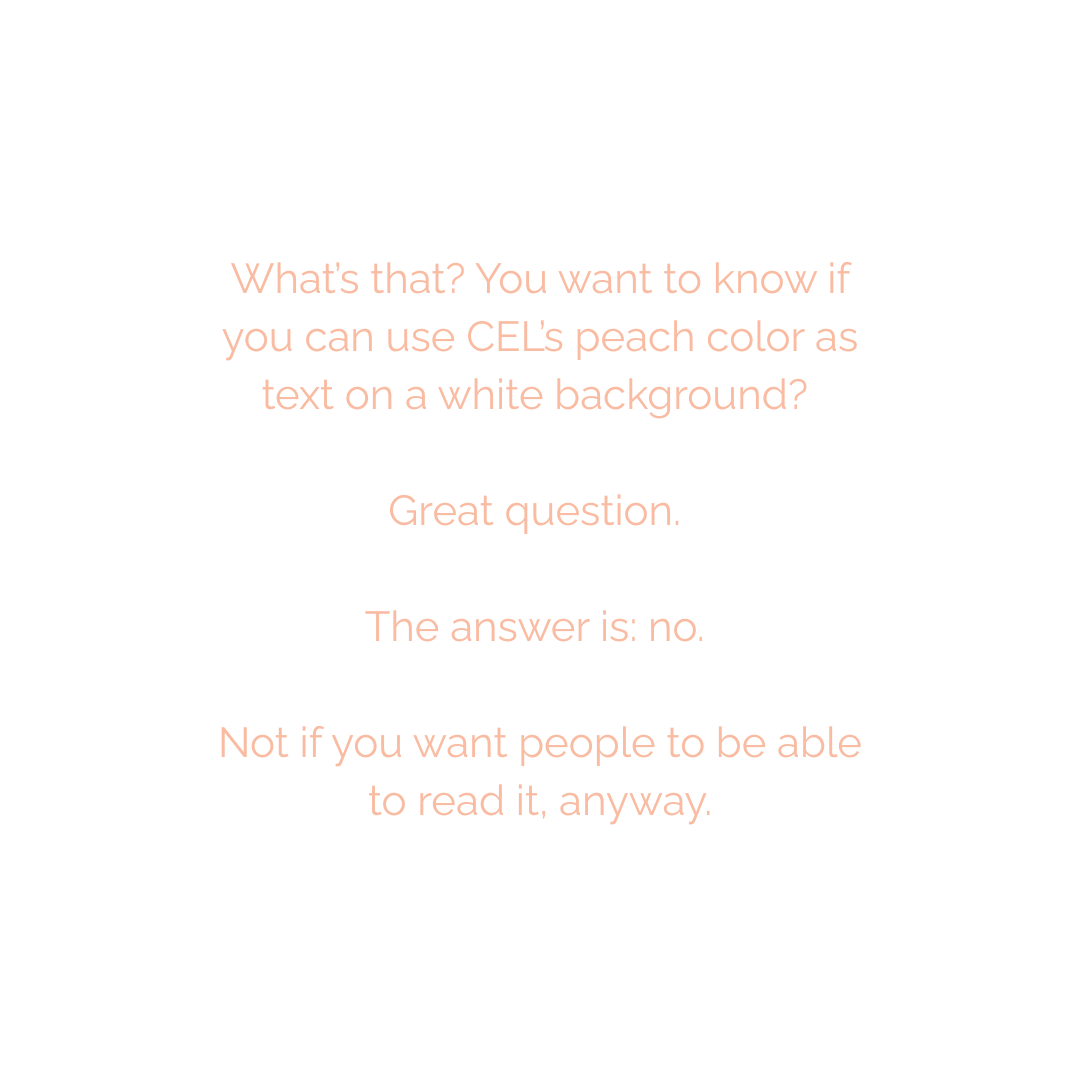
What’s that? You want to know if you can use CEL’s peach color as text on a white background? Great question. The answer is: no. Not if you want people to be able to read it, anyway. Even if you can read the text (being mindful that many people wouldn’t be able to), it doesn’t make for a pleasant reading experience. Meeting color contrast ratios improves the reading experience for everyone.

Don’t check your color contrast more than once

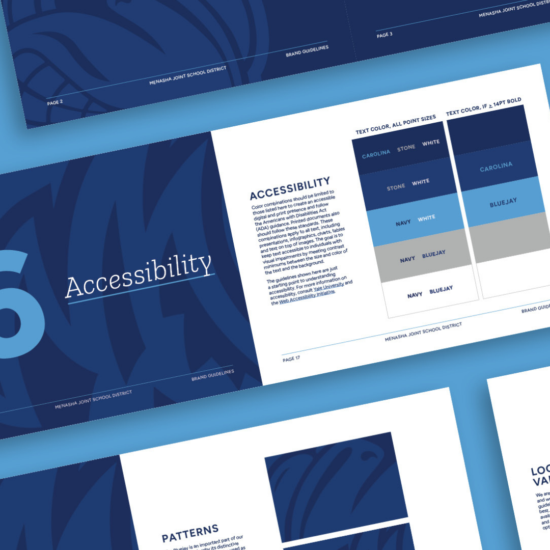
If your brand guidelines don’t have an accessibility cheat sheet, now’s the time to create one. Make a one-page “safe use” guide that shows:

    • which brand colors can be used as text (and at what sizes)
    • which colors should stay as accents only
    • good background + text pairings

This one page saves hours later—and makes templates way easier to build and reuse.

It turns out our brand isn’t accessible! What do I do?

First: you’re not alone. This happens constantly.

Many organizations use brand colors as accents and use simple combinations (such as dark text on a light background) for most content. That’s totally okay.

But if you’re feeling boxed in, a school brand refresh doesn’t have to be dramatic. It can be as simple as:

    • adding 1–2 complementary colors that do meet contrast ratios
    • adjusting a few shades slightly (darker or lighter)
    • defining “digital-safe” versions of brand colors for text and buttons

And yes—contrast applies in both printed and digital spaces. (Print can feel forgiving, but if your flyer gets posted as a PDF, emailed, or viewed on a phone, those issues come right back.)

Does our logo have to be accessible?

Aha, so you found the gray area (no color puns intended). 

No—your logo itself does not have to meet WCAG contrast requirements. Logos are generally treated differently than body text. Though you will want to ensure that they always have alt text associated with them.

That said, here’s the practical tip: if you’re placing your logo on backgrounds where it’s hard to see, you’re still creating a usability problem. Consider creating:

    • a light-background version
    • a dark-background version
    • and a one-color option

Not required. Just smart. And if you decide to do a brand refresh or logo design? Consider accessibility from the very beginning, so your brand designs are usable, not restricting.

Before you hit send: the 60-second check

Here’s the quick “are we being kind to eyeballs?” checklist:

    • Can I read this on my phone without pinching/zooming?
    • Are links obvious (not color-only)?
    • Any text on images? If yes, does it have an overlay or text box?
    • Do buttons have clear, readable text?
    • Is anything “important” communicated only by color?

If you pass this, you’re already ahead of the game. (Note, these aren’t the only accessibility requirements in a document, but for visuals, this is a great starting point).

The bottom line

Color contrast isn’t about making everything black-and-white and boring. It’s about making sure your message actually lands. Your websites, your newsletters, your social media aren’t just “content,” they’re how families find dates, deadlines, resources, and help.

And the goal is simple: less squinting, more understanding.

Published on: January 8, 2026

Topics:

RELATED POSTS