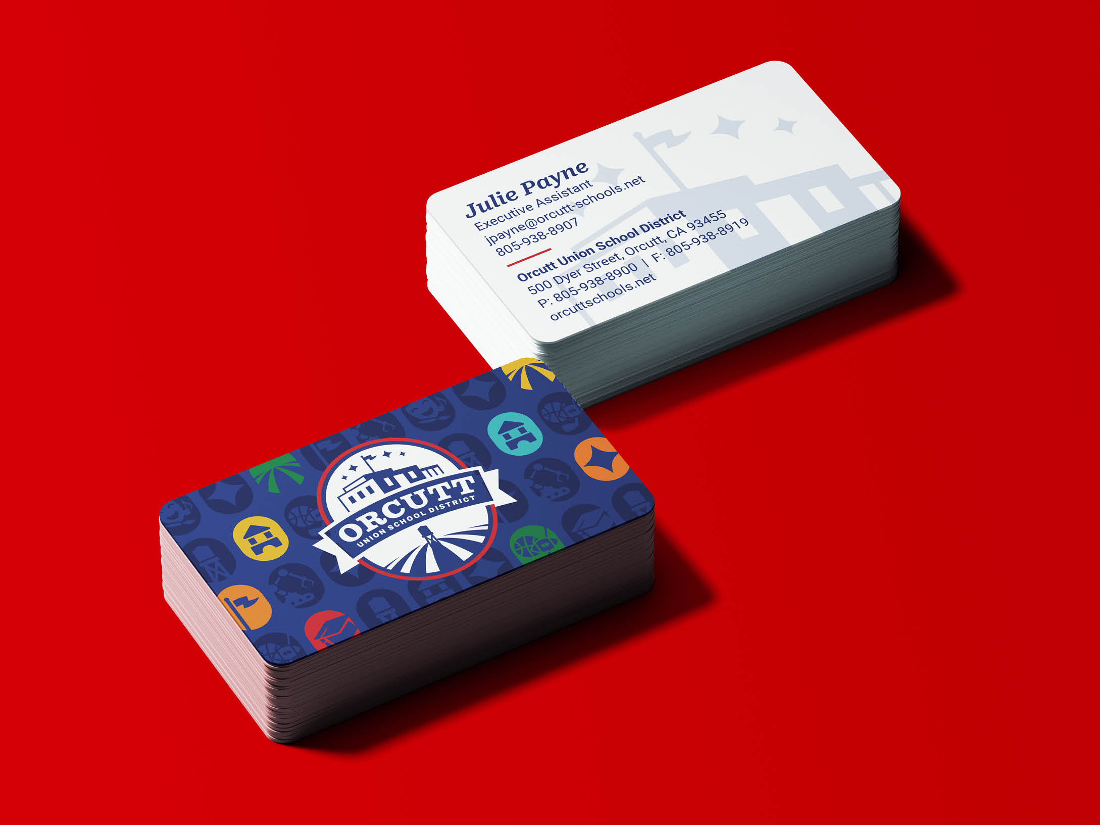
ORCUTT UNION SCHOOL DISTRICT
Turning Community Values into Orcutt’s Brand System
Orcutt Union School District and the town of Orcutt, California are deeply connected—families not only grow up here but often return to raise the next generation of Orcutt natives. The new brand needed to reflect that shared identity while helping the district stand confidently among surrounding districts. Our goal was to capture Orcutt’s historic, small-town feel, the district’s strong academics, and the family-first culture in a new brand that felt both unified and timeless.
One District. One Look.
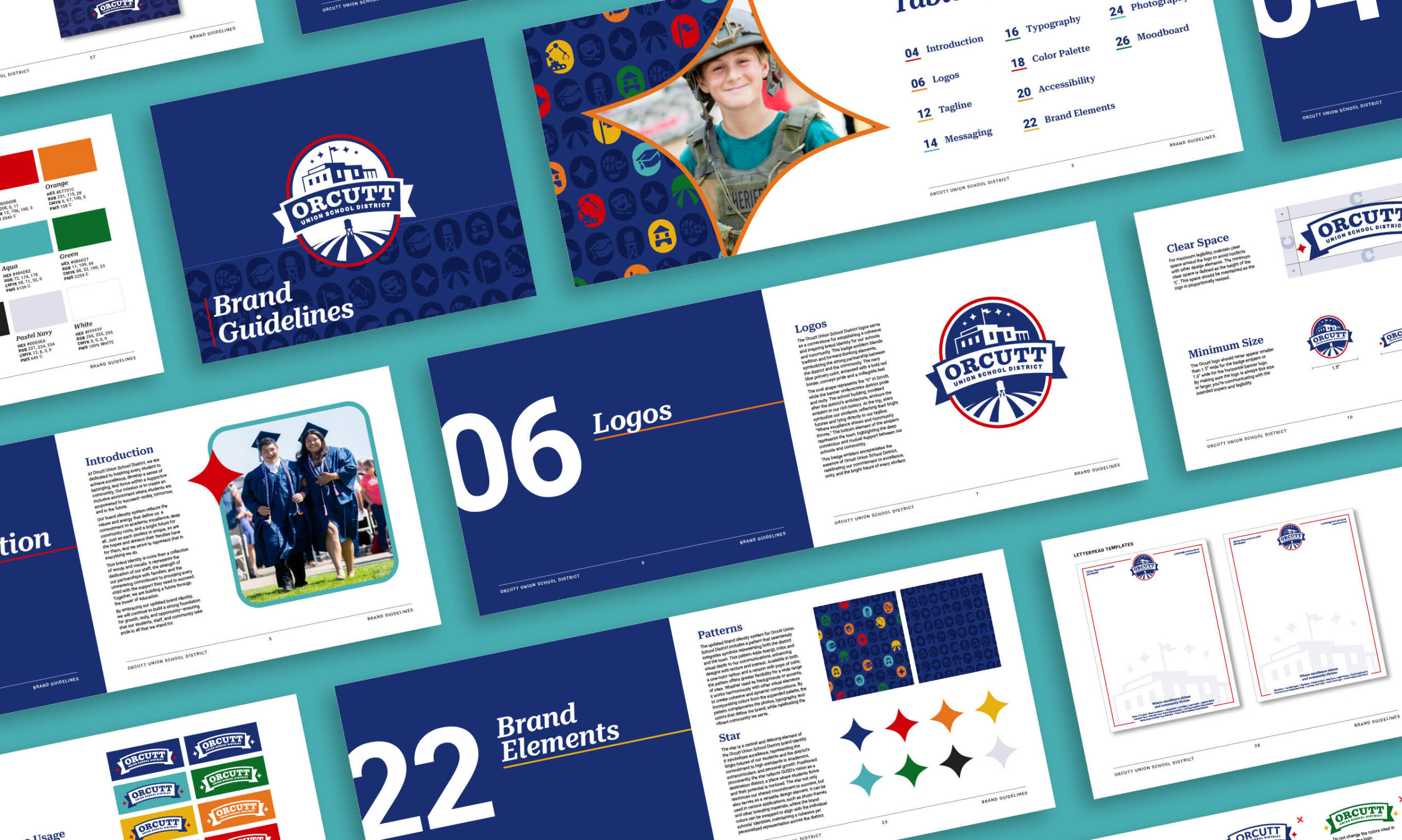
Before the refresh, Orcutt Union School District used multiple logos, color palettes, and visual styles across schools. Over time, each campus developed its own identity and color story, which made the district feel fragmented. Together with district leadership, CEL created a unified brand system that brought consistency while still allowing individual school pride.
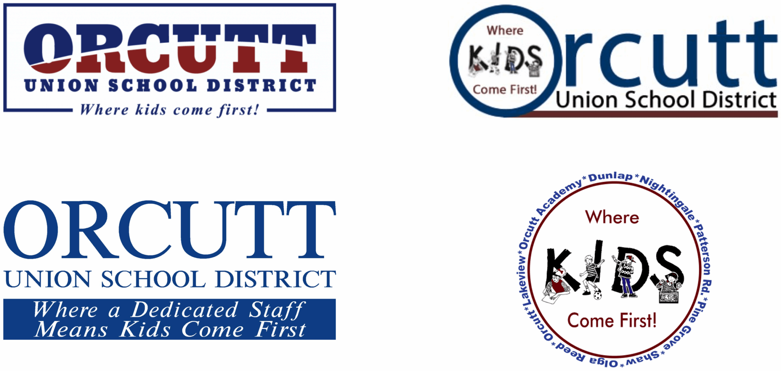
Former Logos
Built on Pride and Place
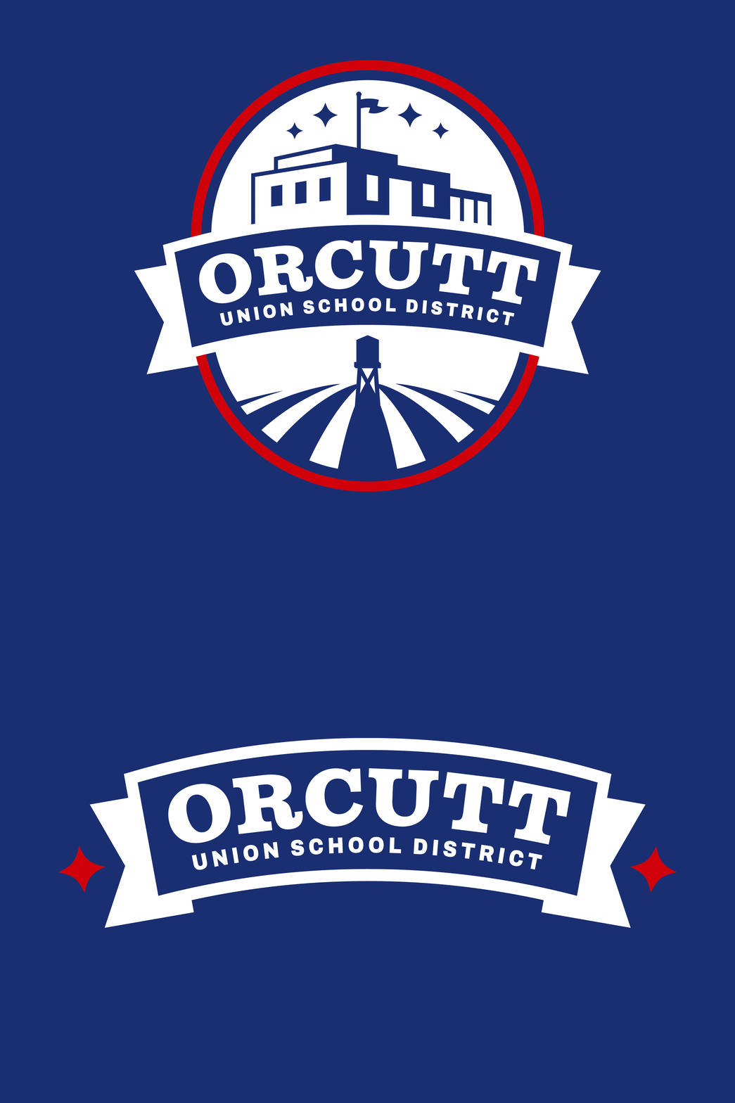
The primary logo was redesigned as an academic, seal-style mark that feels collegiate while being connected to the community. The oval badge shape ties back to the “O” in Orcutt, while the school building icon is inspired by the district campus and the town’s historic architecture. The stars represent students shining and signal Orcutt as a destination district for families, and were also designed to work as a flexible graphic element across materials. The base grounds the logo in the town’s agricultural roots. Together, the logo reflects how Orcutt and the district support one another and thrive together.
Strong, Simple, and Scalable
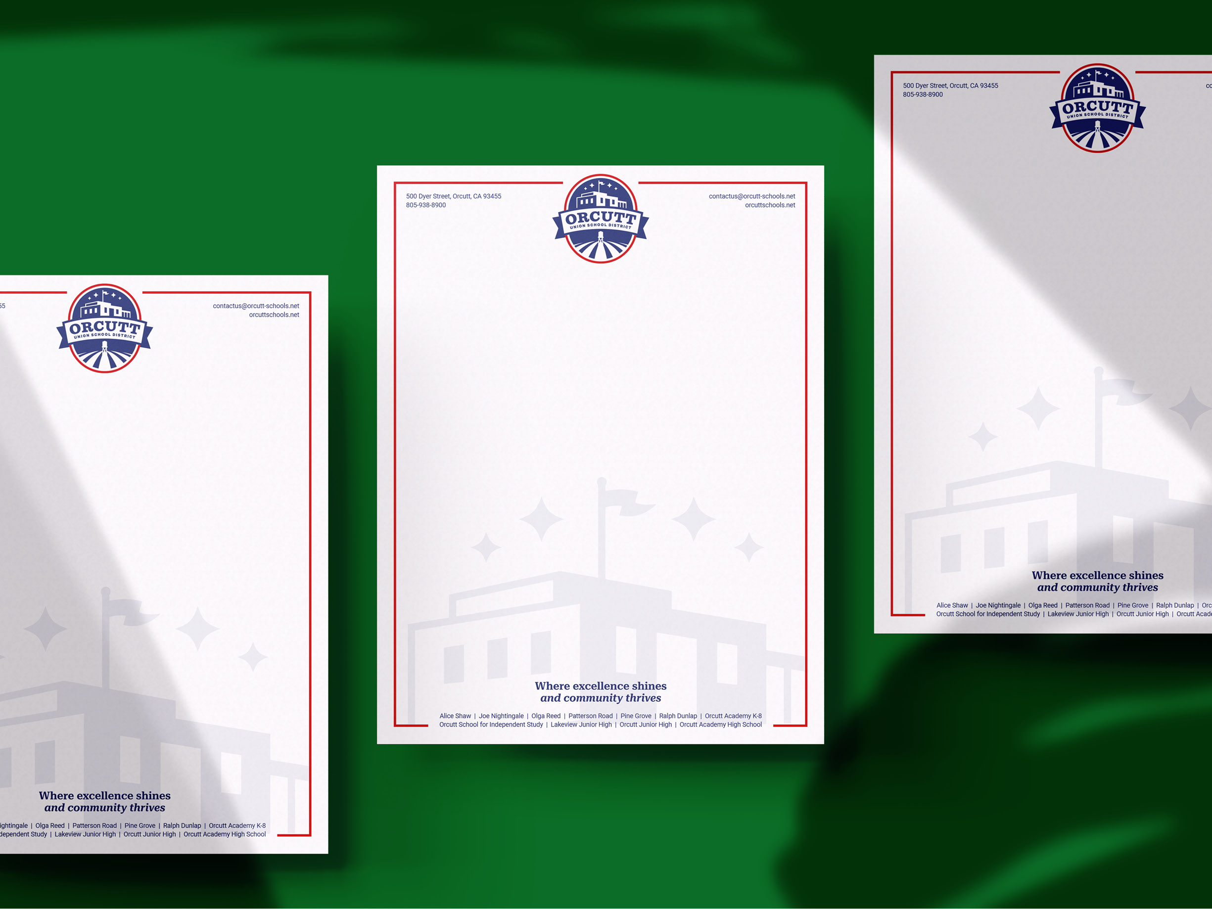
The logo system includes simplified banner and badge variations that scale from letterhead and vehicle decals to large-format signage. The goal was a mark that feels strong and recognizable without being complicated. The badge carries deeper symbolism, while the banner provides flexibility for everyday use—polished enough to represent a high-achieving district. To support rollout, the color palette was refined to center on a deep navy for trust and academic strength, with supporting colors used intentionally to unify the district while allowing schools to retain their identity.
Orcutt, Woven In
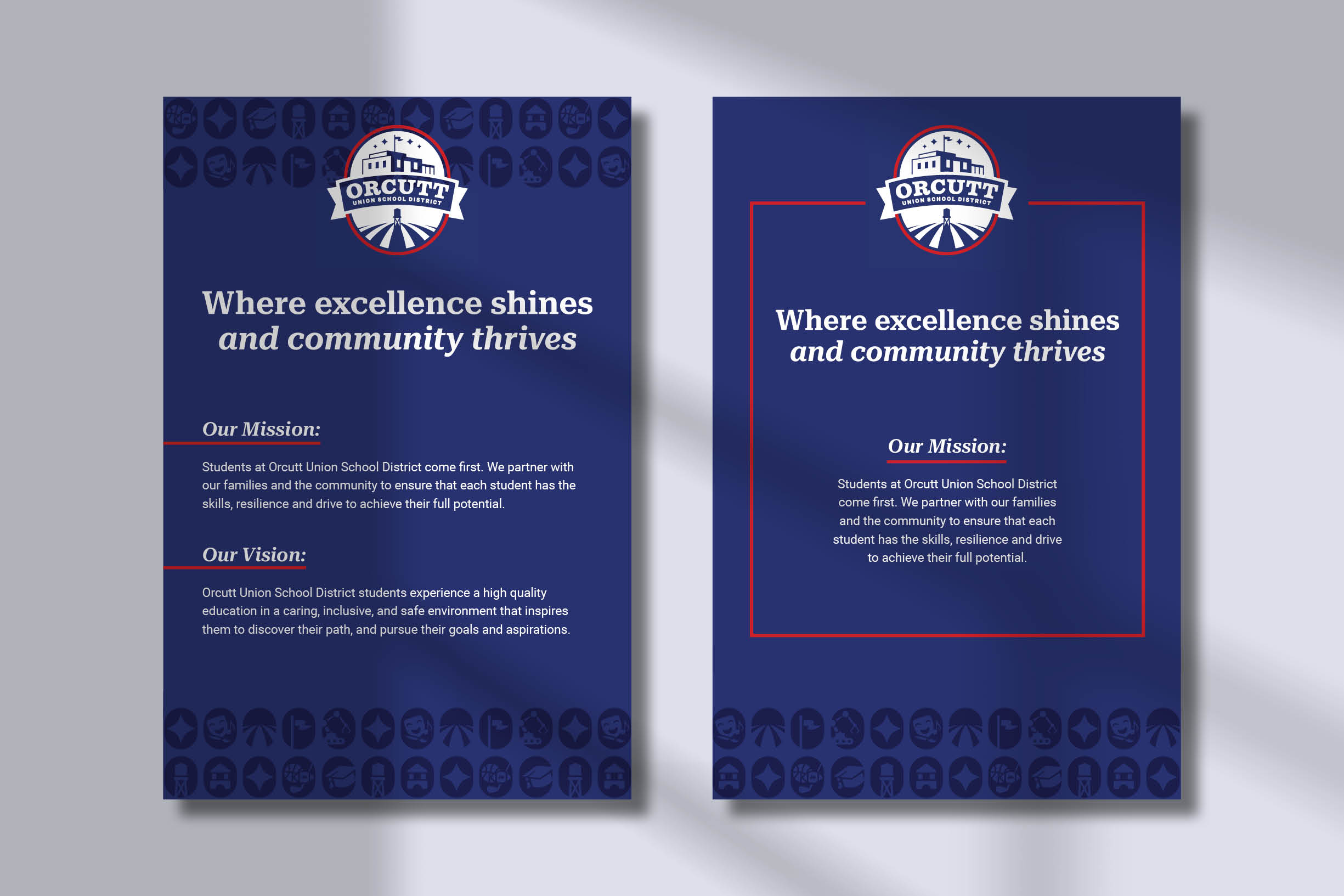
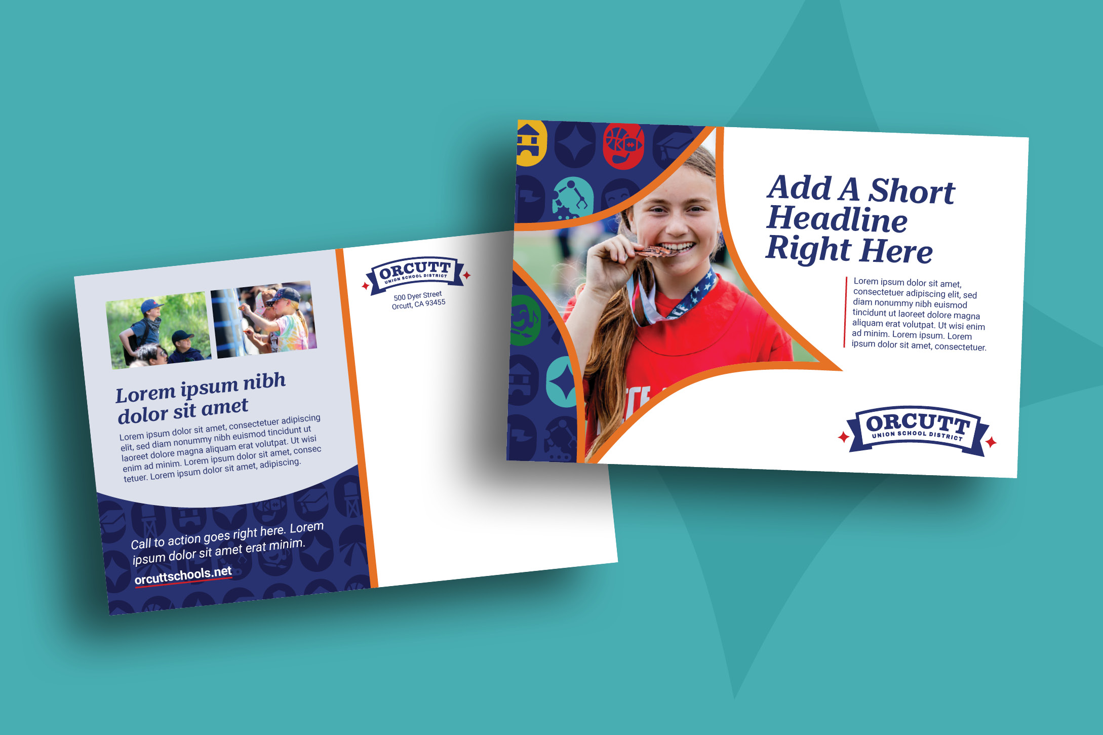
A custom pattern was created using symbols tied directly to the community and district. The historic Orcutt water tower anchors the design, alongside standout elements that reflect Orcutt Union School District’s strengths, including robotics, athletics, and theatre. The pattern introduces the district’s bold new color palette, adding flexibility and personality while maintaining a connection to Orcutt.

A Promise, not a Phrase
Tagline:
Excellence Shines. Community Thrives.
The updated tagline reflects what the district is known for and what families value most: strong academics, visible student success, and a connected, supportive community.
Key Messages: The new messaging framework builds on those same values, refining how Orcutt Union School District communicates across enrollment, outreach, and everyday communication. Innovative Excellence reinforces academic strength and opportunity, Deep Community Roots highlights multi-generational pride, and Driven to Succeed reflects inclusive support and lifelong learning.
A Brand That Feels Like Home
The new Orcutt Union School District brand creates clarity, consistency, and pride across the district. It reflects a community that values tradition, trusts its schools, and believes in its students, supported by a flexible system built to last.
